Most Shopify stores spend all their time getting traffic to websites. But getting visitors to actually buy something is what makes stores profitable. Dfyne, a gym clothes brand from Scotland making $6 million per month, shows that small website changes often work better than expensive marketing.
Here are the website tricks you can use right now to sell more.
Put payment options where people actually look
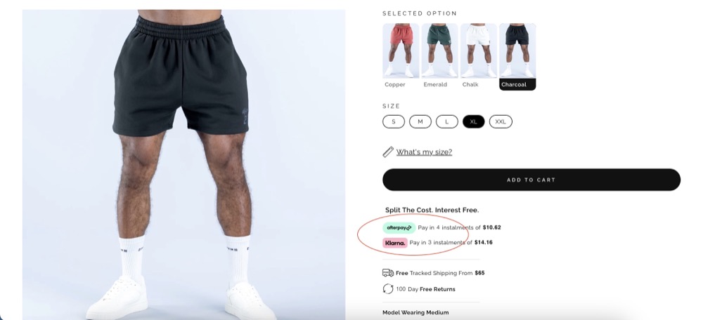
Dfyne puts their Afterpay and Klarna buttons right under the “Add to Cart” button. Most stores hide these options at the bottom of the page where nobody sees them.
This works because it helps customers when they’re ready to buy but worried about the price. When they see “pay in 4 installments” right there, it removes their biggest reason not to buy.

Write less, sell more
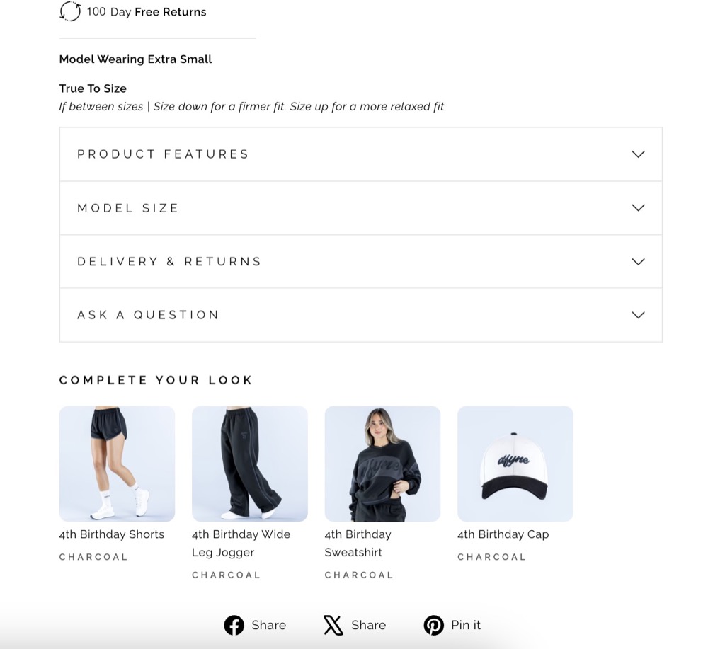
Dfyne barely writes anything on their product pages. No fancy marketing language about “premium performance” or “revolutionary technology.” They just tell you the model’s size, how to wash it, and what it’s made of.
People buy clothes because they like how they look, not because they read a paragraph about fabric technology. They want to imagine themselves wearing it.

Make color switching work smoothly
Dfyne shows different colors clearly, but their images load slowly when you switch between them. For clothing stores, people need to see colors and styles quickly to make decisions.
How to do this: Make images load instantly when people click different colors. Use apps that preload images so there’s no waiting. Make images smaller files so they load faster, but keep them looking good.

Show exactly what customers get
Dfyne shows photos of their actual packaging, even though it’s just a plain cardboard box. This isn’t fancy, but it helps people trust the purchase because they know what to expect.
When people don’t know what’s coming, they hesitate to buy. Showing everything removes this worry.
Keep navigation simple
Dfyne’s website menu is simple and focused. They don’t overwhelm people with tons of categories or complicated dropdown menus. The website guides people toward buying instead of just browsing.
Too many choices make people leave instead of buying. Simple navigation with clear paths to popular products works better.

