Have you been making efforts to increase your sales one Shopify? One good method is to add a recommended products or “cross-sell section” on your store. It’s a strategy that can increase \ sales, and also elevate customer experience. But you need to do it the right way. If your recommendations distract visitors too much, it may cause frustration. In this article, we will suggest where to put cross-sell on your Shopify website and highlight some of the best places that work best.
What is recomended products/cross-sell?
If you are marketers or business owners, you might know what it is. Cross-selling on Shopify is when you suggest extra products to customers that go well with what they’re already buying. For example, if someone is buying a phone, you might suggest they also get a phone case or screen protector. This helps you sell more by encouraging customers to add extra items to their purchase.
Where to put cross-sell effectively on shopify?
Take note that wherever you put the cross-sell, you should avoid putting too many cross-sell offers on one page. If you add too many, the page can look messy and confusing, which might stop customers from buying anything. There are some specific pages to put cross-sell including
Product Pages
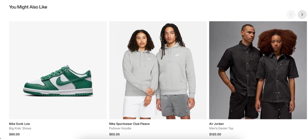
This is where people see a product and yes they have the intention to buy it. Ideally, you should put the cross-sell below the product details so that the customer experience won’t be disrupted. This is a very common place. For example Nike placed the cross-sell at the end of the product showcase
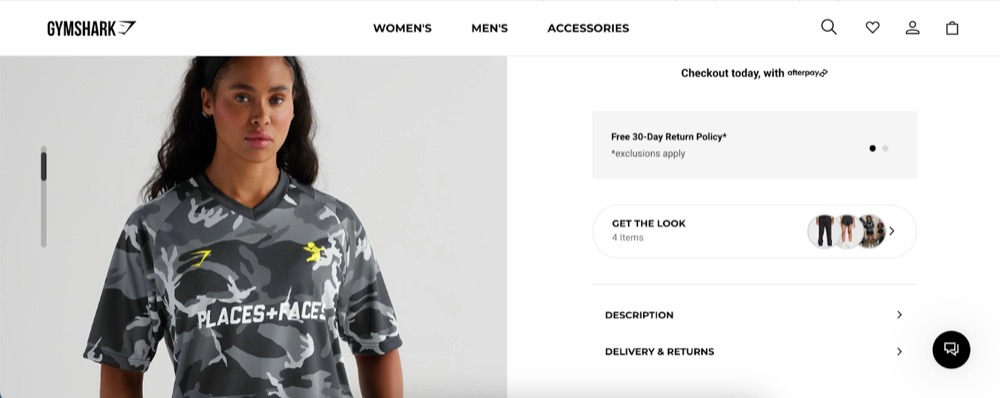
Or you place it like Gymshark with the text “Get the look”
Shopping Cart
Putting cross-sell offers in the shopping cart is a good idea because the customers are already in the buying mindset. If the suggested products are relevant, they might consider adding another purchase.
Some ideas for a cross-sell design
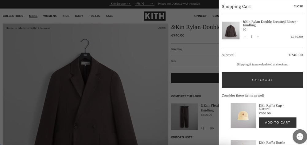
(Kith website)
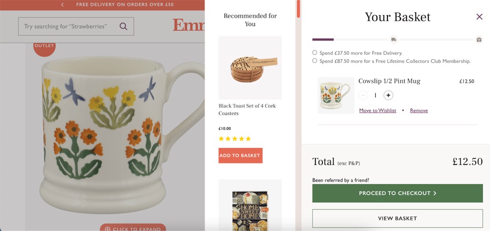
(Emma Bridgewater)
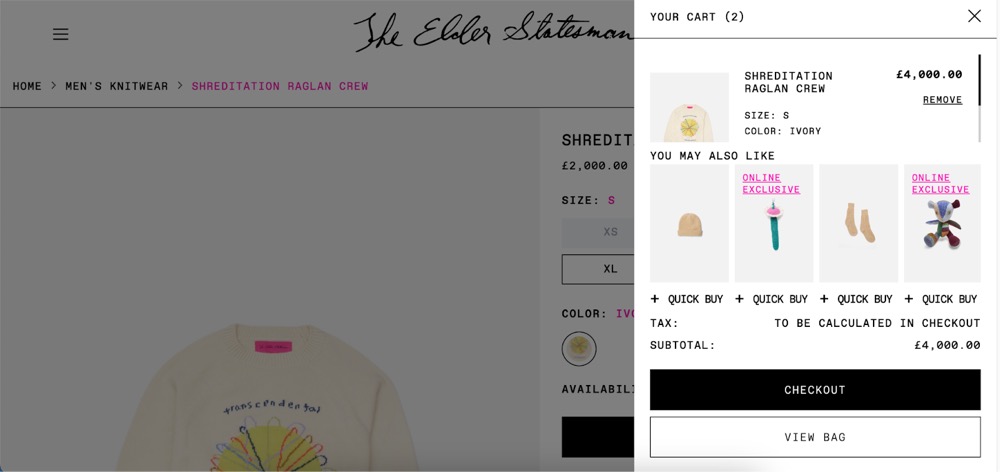
(Elder Statesman)
Checkout Page
This tactic plays on their buying momentum, making them more likely to agree to an additional, smaller decision, which feels less risky compared to the original purchase.
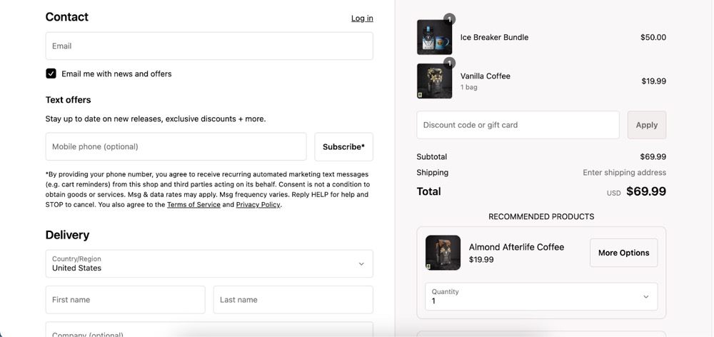
(examples from Death wish coffee)
How to make a good “cross-sell” box
If you’ve placed your cross-sell box in the right spot, it’s time to make sure it looks great. A poorly designed box can annoy or confuse your customers. Here’s how to make it work:
- The cross-sell box blends with the rest of your site. Use the same colours as your website so it feels like a natural part of the page, not something out of place. This way, customers won’t feel like they’ve been redirected.
- Use custom fonts or bold text to grab attention.
- Add a pop of colour like orange, red, or yellow to your call-to-action button to make it stand out and spark interest.
- Suggest products that go well with what the customer is already buying. For example, if someone buys workout shoes, recommend gym clothes.
- Personalised suggestions make customers feel valued and understood, which can increase the chance they’ll buy more.
In summary, a great cross-sell box should include:
- Title: Use phrases like “You May Also Like” or “Recommended for You.” or you can be creative with the title.
- Product Image: Show clear, high-quality images.
- Product Name: Keep names simple and easy to understand.
- Short Description: Add a brief description highlighting key benefits.
- Price: Display the price and any discounts.
- Add to Cart Button: Make sure the button is easy to find and click.
Best Shopify Apps for “cross-sell” box
If you already know where to put Cross-Sell on your Shopify website, using these apps can help you create a good one in just a few minutes.
Frequently Bought Together
- Description: This app uses machine learning to automatically generate product bundles and cross-sell suggestions based on historical order data. It helps increase the average order value by suggesting items that are frequently bought together.
- Ratings: ⭐ 4.9 / 5
- Features:
- Automatic bundle creation based on real data
- Manual bundle customisation
- Highly customisable design
- One-click installation
Bold Upsell
- Description: This app allows you to create targeted upsell and cross-sell offers that appear at key moments in the customer journey, such as during checkout or when adding an item to the cart.
- Ratings: ⭐ 4.7 / 5
- Features:
- Customisable upsell and cross-sell offers
- Add offers directly to the product page, cart, or checkout
- Detailed analytics and reporting
- Easy setup and integration
ReConvert Upsell & Cross-Sell by ReConvert
- Description: This app focuses on post-purchase upselling and cross-selling by customising thank-you pages with targeted product recommendations.
- Ratings: ⭐ 4.9 / 5
- Features:
- Customisable thank-you pages
- Personalised product recommendations
- Integration with email marketing and automation tools
- In-depth analytics
Conclusion
In conclusion, placing cross-sell offers in the right places on your Shopify website can help you sell more and make customers happier. Remember to put them where people are already shopping, like on product pages, in the shopping cart, and at checkout. Don’t overwhelm your customers with too many offers on one page. Test different spots to see what works best for your customers, and you’ll see your Shopify sales grow. You can create a cross-sell box using apps from the Shopify App Store or by working with a Shopify retainer service to integrate it seamlessly into your site.


