
The importance of landing-page in marketing success
A well-designed landing page can be the difference between marketing success and failure. It serves as the gateway to your brand, product, or service, often being the first point of contact with potential customers. Its design plays a crucial role in grabbing attention, effectively conveying your message, and ultimately converting visitors into customers.
While the importance of design is clear, many marketing managers and founders face challenges in effectively communicating their design ideas, especially if they lack design experience.
The purpose of this article is to equip marketing managers and founders with the knowledge and tools needed to overcome these challenges and create effective wireframes/mockups for their landing pages.
Understanding Wireframes and Mock-ups
What are wireframes and how does it fit into the website development process
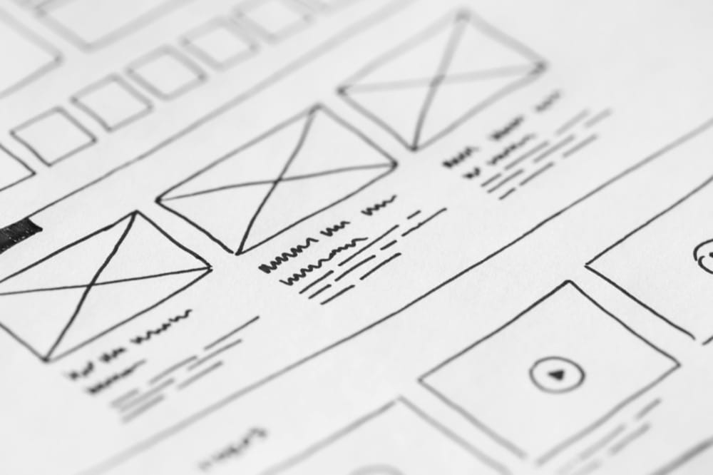
A wireframe is like the “pillar” of a design, containing all the essential parts of the final product. It’s a basic visual representation of the product. Usually, wireframes use simple graphic elements, like straight lines, boxes, basic shapes, with shades of gray, black, white to represent information about architecture, content, or layout.
Making a wireframe is a great first step in the early stages of a website development project. By making one you can quickly get feedback on your design and layout ideas without a huge upfront investment of time and resources. A wireframe can also help you figure out the visual hierarchy of information so that you can nail down the perfect copy and CTA before handing it all over to a developer.
At this design level, you are free to chop and change as you please. Big changes to layout don’t come with big costs – and all ideas are still on the table. You can move content around or group it together, add or remove elements, relatively easily compared to later stages of design, where this can become more costly and can also greatly delay your project. In our opinion, don’t skip the wireframe stage.
What are mock-ups and how do they fit into the website development process
A mockup is the next step after wireframe, acting as a bridge between the structure (wireframe) and a prototype. This is where designers add detail to your initial wireframe. They use colours and fonts to enhance the design and also may prepare graphics or images for use throughout the page.
A mockup will give you a visual representation of how a landing page will look, without the functionality.
What is the difference between a wireframe and a mock-up?
| Feature | Wireframe | Mockup |
| Purpose | Basic visual representation of the landing page structure. | Bridge between structure (wireframe) and prototype |
| Design Elements | Simple graphic elements like lines, boxes, basic shapes | Refined graphic elements aligning with brand identity |
| Colour | Typically uses muted shades of gray, black, white and blue. | Colour is used as it will be in the final landing page. |
| Functionality | Focuses on architecture, content, layout | Close to final aesthetic without functionality |
| Presentation | Overview of creative strategy and usability assumptions | Engages clients and investors visually |
| Usability | Provides overview of navigation and usage | Presents to investors or stakeholders with good feedback |
| Flexibility | Allows for easy content rearrangement and element adjustments | Raises questions about interaction and design across devices |
| Importance | Great starting point for interaction design process | Important component of project documentation |
Why Non-Designers Should Learn to Wireframe
Wireframe provides an overall picture early in the process, used for discussion with clients. From a practical standpoint, wireframes ensure that the page’s content and functionality are complete and accurately positioned based on user and business needs. This is the biggest advantage that wireframe structures offer users.
Secondly, wireframe simplifies abstract concepts into specific, easier-to-understand objects, making them more visually accessible.
Thirdly, wireframes accurately depict and reflect the features of a website, providing clear information on how these features operate and their usefulness, aiding decision-making in feature selection.
Fourthly, wireframes prioritize usability by objectively assessing elements like navigation paths, link naming, and placement, identifying potential architectural flaws and enabling effective risk management and backup solutions.
Last but not least, wireframes streamline the creative and branding aspects of website development, allowing for early client feedback and clearer communication, ultimately saving time in the process and making everything more straightforward and concrete.
Choosing the Right Tool
There are plenty of wireframe design tools out there, but here are a few that I think would be suitable for both beginners and seasoned professionals
Sketch
Sketch is popular among iOS users. It’s been around since 2010 and focuses on vector design, with a large resource library shared by its community members. Its simpler interface compared to other vector design tools makes wire-framing quick and easy.
Figma
Figma is one of the most popular wireframe design tools. It offers useful features for both independent projects and team collaborations. Wireframing with Figma is convenient and fast, especially with its web-based platform allowing for easy team collaboration and commenting.
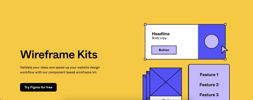
(Figma offers free Wireframe Kits)
Basic Components of a Landing Page Wireframe
Here are the basic components of an Landing Page wireframe
Header, body and footer
Header
The header is undoubtedly the first thing customers see when they land on your Landing Page. Therefore, crafting a headline that is impressive enough to capture and hold the customer’s attention in the first few seconds is crucial.
The headline is evaluated as one of the key factors of an effective Landing Page because it not only creates a visually appealing design but also encourages customers to follow through with the subsequent content. Some important roles of the headline on a Landing Page include:
- Capturing attention and sparking interest, tapping into the curiosity of users.
- Providing a clear reason why customers should care and continue reading the content on your Landing Page.
- Clearly identifying the target audience by using appropriate language and content.
- Demonstrating an understanding of the problem or need of the customers.
Body
In an effective body layout, showcasing the benefits and features that the product/service brings is an indispensable factor. Businesses need to highlight the benefits that the product brings through its extremely useful features for customers. At the same time, these product features will help customers understand how they can solve their problems or meet their needs.
Another one is client’s testimonials. Customers tend to trust the reviews and feedback from people who have used the service or product more than the words of the business advertising. Therefore, to build trust with customers, businesses need to compile reviews and feedback from other customers about the effectiveness of the product/service provided by the business.
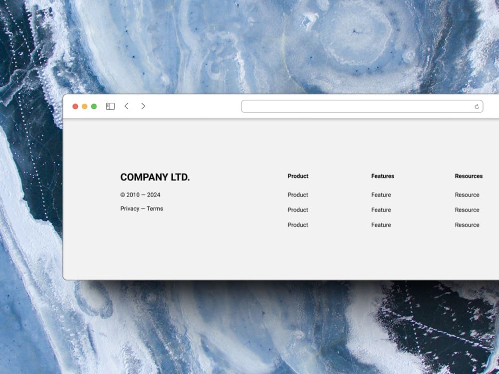
Footer
Footer, although not directly contributing to increasing conversion rates, typically contains important contact information for the business.
As mentioned earlier, regarding the issue of Conversion Leak when placing outbound links on the Landing Page, some Landing Pages still prefer to include links to their Fanpage, Website, Instagram, integrated Facebook Comment, Policy, etc. These links should be placed at the bottom to minimize negative impacts on the conversion rate.
Therefore, the footer serves as a space to include essential information such as contact details and links to various platforms, while also being strategically positioned to minimize any potential distraction from the primary conversion goal of the Landing Page.
Calls to Action (CTAs)
The Call to Action (CTA) is also a key component of an effective Landing Page. It helps you encourage customers to take desired actions through various positive impacts such as:
- Guiding customers to perform specific actions like purchasing a product, signing up for a service, downloading a document, filling out a contact form, etc.
- Making the website clearer and easier to understand through clear directions in the structure.
- Prioritizing specific actions by always placing them in a position that customers can easily see.
- Persuading customers to take action through the use of compelling and stimulating language such as “Buy Now,” “Sign Up Now,” “Get the Deal Today,” etc.
- Optimizing the conversion rate so that visitors not only view the content but also take directed actions.
CTAs are essential for prompting visitors to engage with your Landing Page and move them further along the conversion funnel.
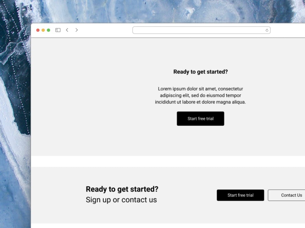
Image and text placeholders
When discussing the main components of an effective page, visuals and texts are a must. It would be dull if your Landing Page only contained long blocks of text or too many images that strain the users’ eyes. The use of carefully selected visuals and texts should be appropriate and have the ability to build trust to achieve benefits. It is better to combine strong visual impressions with impactful texts to convey a sense of professionalism in the eyes of the customers. You also have to check and optimize image and texts display on mobile devices
These elements play a crucial role in the success of a Landing Page by attracting and retaining the attention of visitors and ultimately converting them into customers.
Form elements
The main component of an effective Landing Page that many businesses use to collect contact information from customers is the registration form, as it helps to:
- Gather contact information from potential customers.
- Create a list of potential customers or individuals interested in your product or service.
- Gain a better understanding of those interested in your product or service and serve them better.
- Manage and interact with customers effectively by measuring the performance of the conversion rate from the registration form.
Tips for Effective Wireframing
Start with a goal: Focus on the purpose of the landing page
Understanding what you want your website to achieve can really help any project. For example, if you want lots of people to visit, it’s good to see what they like and what gets their attention on the site.
When you make wireframes, you’re basically planning out how people will move through your website. You start with some simple things they can click on, then pick the important ones to make a complete journey. Having those basic things ready makes it easier and faster for people to move around the site.
Keep it simple: Utilize basic shapes and avoid too much detail
For a Landing page layout, businesses shouldn’t be too “information-hungry” by cramming too much onto it.
Through that primary goal, businesses should only provide information that aligns with the goal. Additionally, the Call to Action button should guide customers towards actions that support the main goal set by the business.
Use a grid: Ensure alignment and consistency
There’s a wealth of theory surrounding grid systems, but we won’t go too deeply into it. Think of it as “a structured and simple way to arrange elements.”
Design Best Practices for Non-Designers
As non-designers, colours, fonts and space are three basic practices that you should keep in mind
Fonts
When choosing fonts for headings, subheadings, or text, opt for ones that are easy to read and effective for your readers. Avoid fancy and hard-to-read fonts, as simplicity is key. Simplifying is important because most people find it difficult to scan through multiple fonts in a document. So, try sticking to a few fonts that suit your style.
Space
Be careful not to overcrowd or space out elements too much in a document. If elements are too close, it can be hard to read, while too much space can make information scattered. Pay attention to spacing between words and letters. Sometimes, creating some space between them can make your document look more airy.
Colour
Adjusting background brightness or text colors primarily aims to make your document clear and readable. Using contrasting colors for text and background or applying white or black text on images can create a “cut-out” effect.
Turning Wireframes Into Mock-ups
Converting wireframes into mock-ups is a crucial step in the design process because stakeholders rely on mock-ups to decide whether to invest, collaborate, or suggest changes. This can save a lot of time from the outset, avoiding scenarios where the entire product team works on something only to have to redo it because stakeholders aren’t satisfied.
Adding more detail to your wireframe
First step is to start by enriching your wireframes with more imagery and additional details. This involves adjusting layouts, adding placeholder text, and specifying positions for images and other elements.
Incorporating color, typography, and images
Next, based on client’s requirement or brand guidelines, pick a suitable colour and appropriate font to enhance readability and convey the desired tone. Integrate imagery and graphics that align with the content and overall design.
Using pre-designed UI kits and components for speed
Take advantage of pre-designed UI kits and components to speed up the mock-up creation process. These toolkits typically include common interface elements like buttons, forms, and navigation bars, helping save time and ensure consistency in design.
Previewing and sharing your mock-up with the development team
Once your mock-up is complete, preview it to ensure everything looks cohesive and functions as expected. Share the mock-up with your development team for feedback and validation. Tools like Adobe XD, Sketch, or Figma facilitate easy collaboration and file sharing.
Conclusion
Creating landing page wireframes/mock-ups can be challenging, but if you grasp all the basics introduced in this article, your work will be much easier. Remember to start with basic design elements first if you are not a professional designer. If you need to upgrade your landing page, contact Kahunam for collaboration. Or check out other articles in Web Design blog category.