Close Up
Brand development – Your Head In Mind
We’ve helped create a visual identity for the brand that really shows off the powerful experiences they offer. The main focus? Mental health support that’s accessible to everyone.
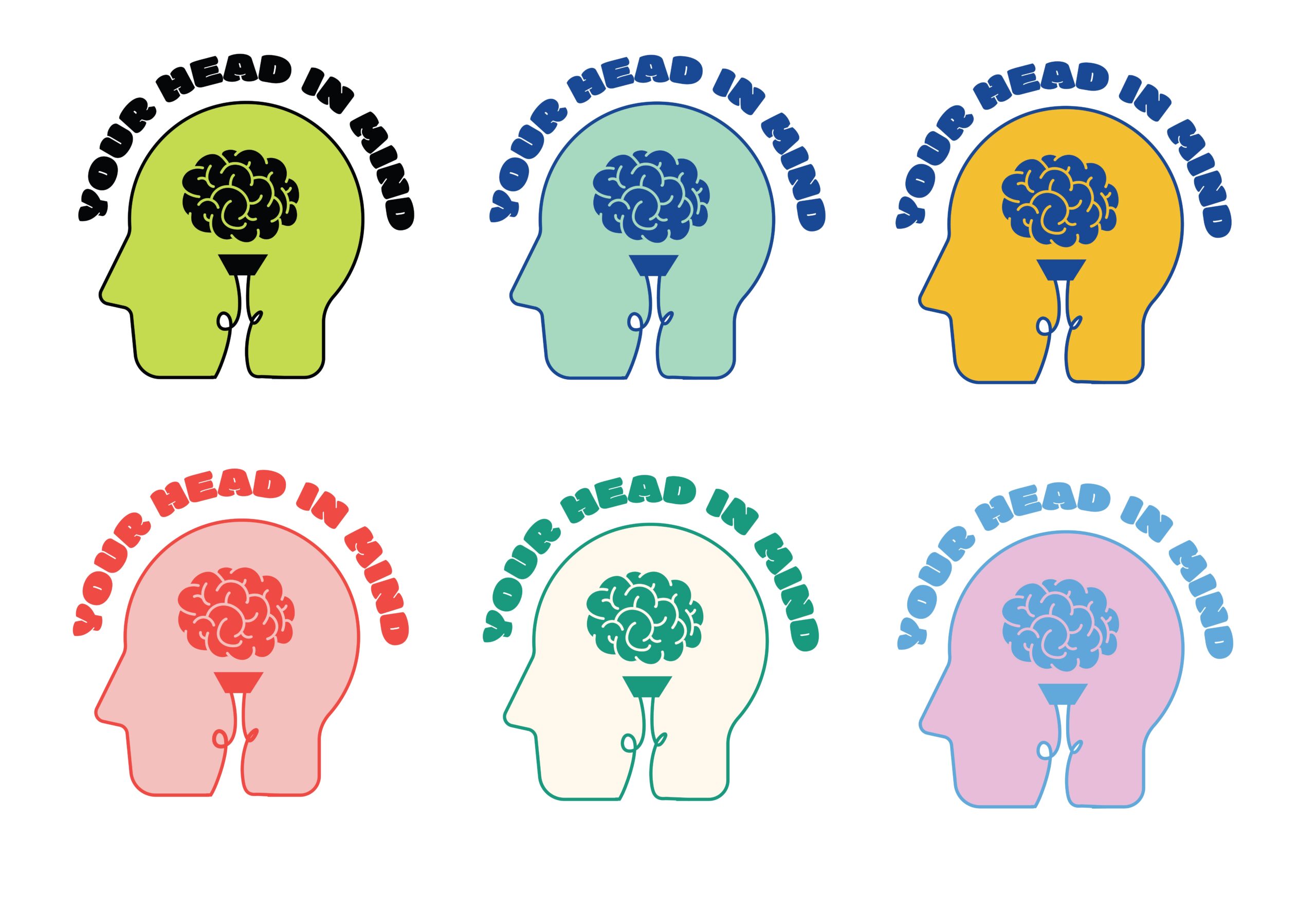

The brand story
Your Head in Mind is a platform focused on providing accurate scientific mental health advice. But that’s not all – they’re also building a global community where everyone can find support and connect with others.
The idea started after founder Kyle Clow went through his own struggles with mental health and the existing mental healthcare system in the UK.
Kyle was inspired to start Your Head in Mind because he wanted to help people stuck in a similar situation.
A surpirsing collaboration
So, here’s a bit of a story about how Your Head in Mind got its look.
Scott Dooley, our CEO and founder, was just having a scroll through LinkedIn one day. He stumbled upon a post from Kyle Clow (a mutual connection), who’d just started Your Head in Mind. Kyle was on the hunt for someone to help build up his brand. Now, Scott thought Kyle’s idea was pretty brilliant. After all, mental health is crucial for all of us, isn’t it? So, he reached out.
Milestones for Your Head In Mind Brand Project
Creating the look for Your Head in Mind wasn’t just a quick job – it took us time to get it spot on.
Receiving and analysing the brief
Task: Analyse the initial brief (we named it V1 – Kyle – Branding Project Questionnaire) to understand the client’s goals.
Actions:
Understand the client’s vision for the brand and the desired tone (health-focused, friendly, less industrial).
Read and review the brief thoroughly.
Identify key themes, target audience, and brand message.
Perform market and competitive research for relevant insights.
Draft concept development
Task: Create initial draft concepts based on the brief.
Actions:
Consider brand personality and potential color palette.
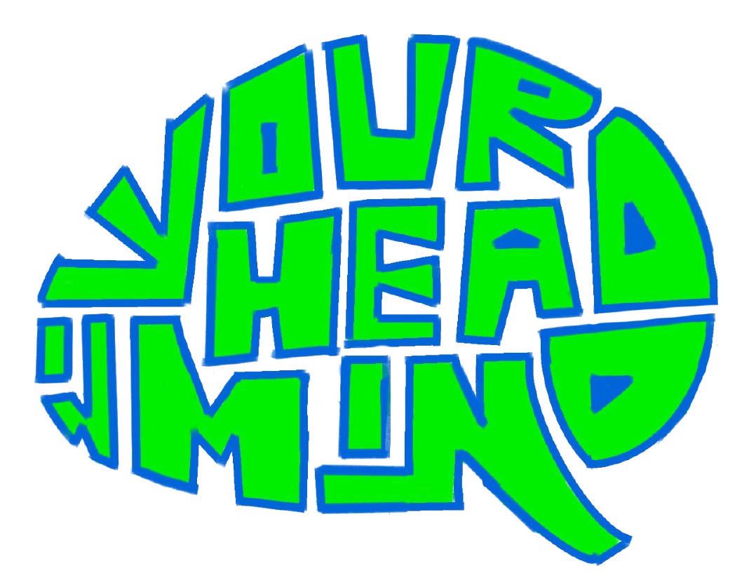
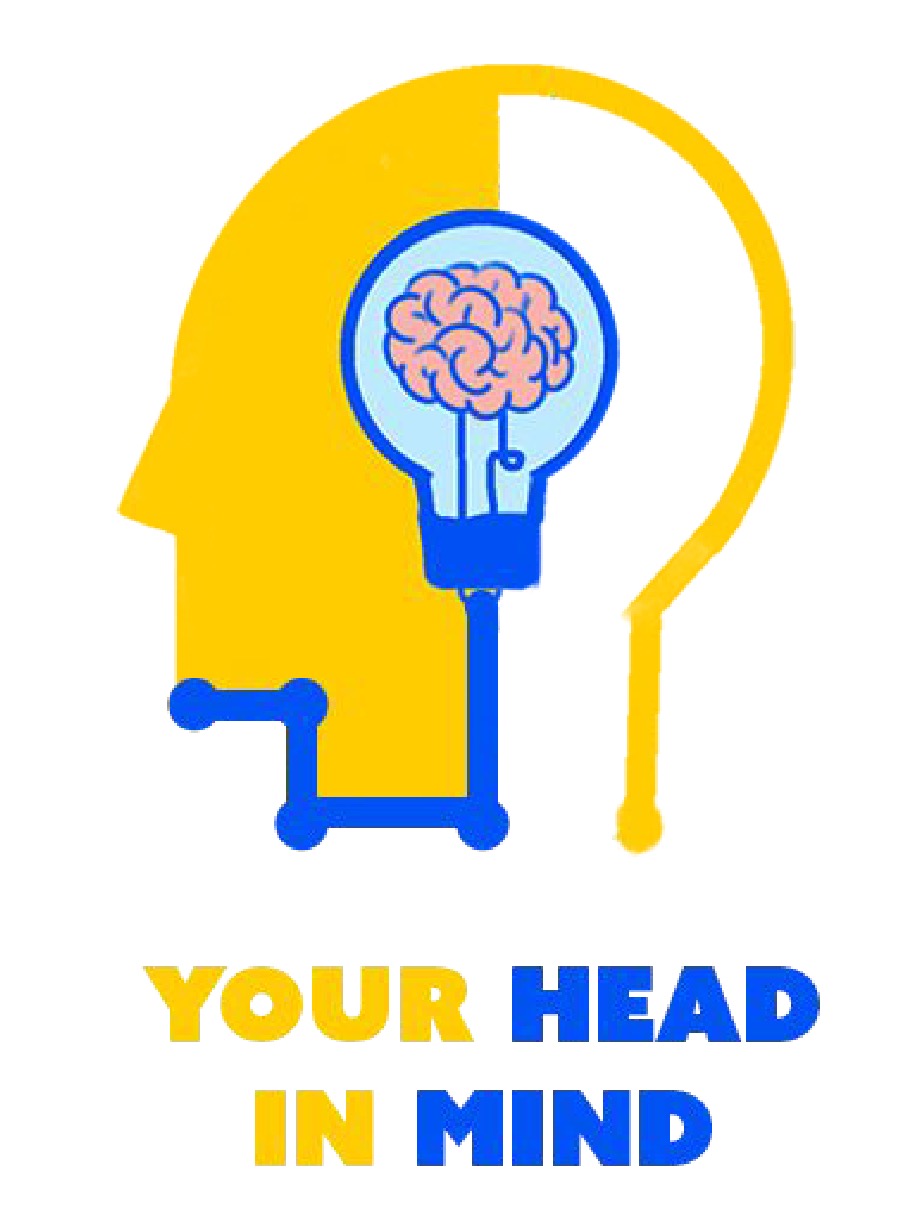
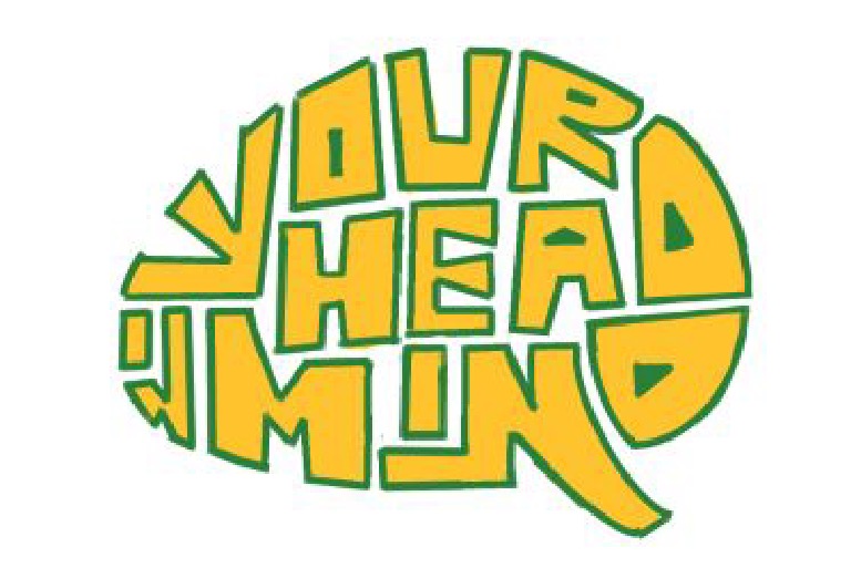
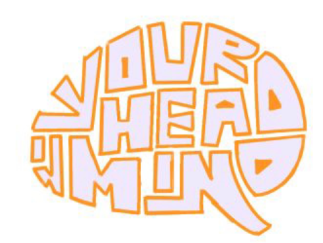
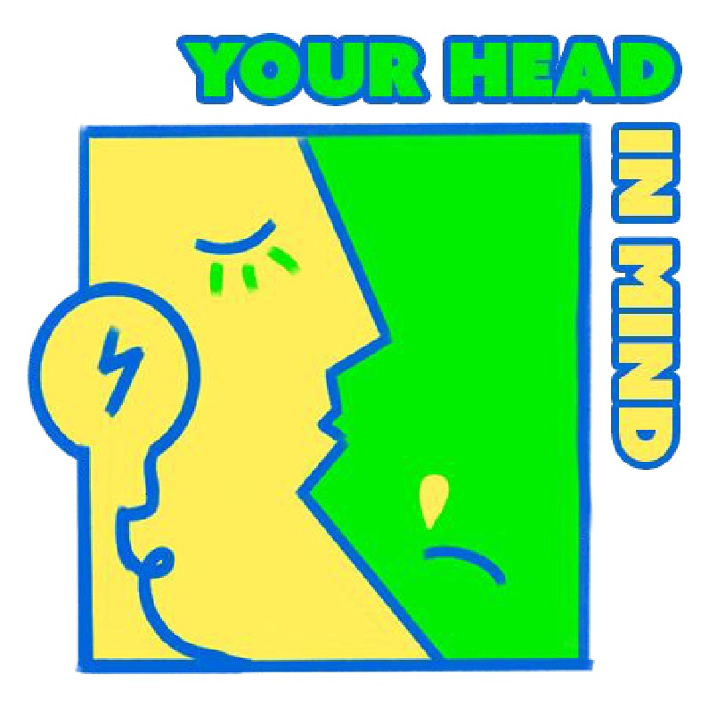
Develop three unique design concepts:
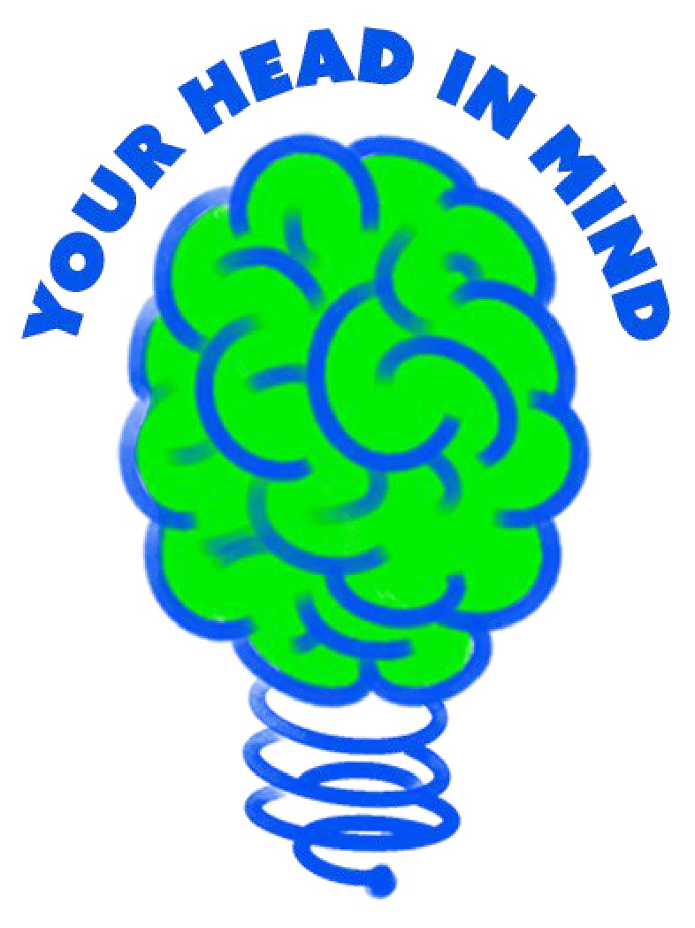
Concept 1: Initial approach.
Concept 2: A more approachable, less industrial design.
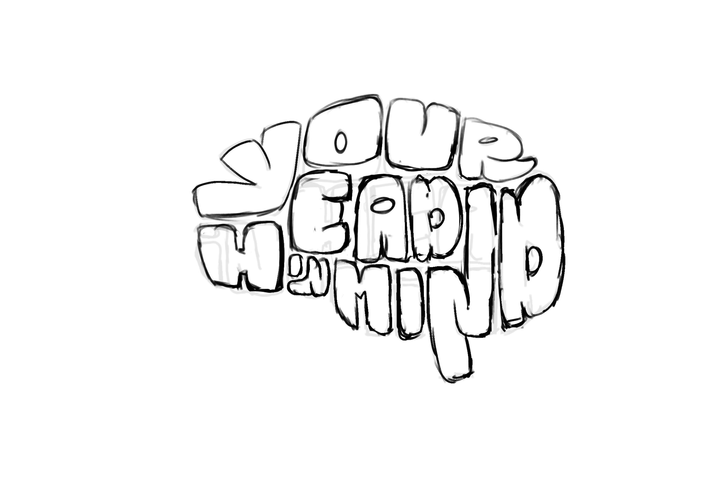
Concept 3: A concept resembling a brain for a more fitting visual representation.
First client feedback
Task: Gather and consolidate client feedback on draft concepts.
Actions:
Receive feedback from multiple team members.
Scott consolidates feedback and provides a summary.
Key points:
Concept 1: Discard.
Concept 2: Adjust design to be more friendly, reduce industrial feel.
Concept 3: Make the design more brain-like.
Color Palette: Adjust for a softer, friendlier palette with a focus on inner health and mental well-being.
Design revisions based on first feedback
Task: Revise designs based on feedback from the client.
Actions:
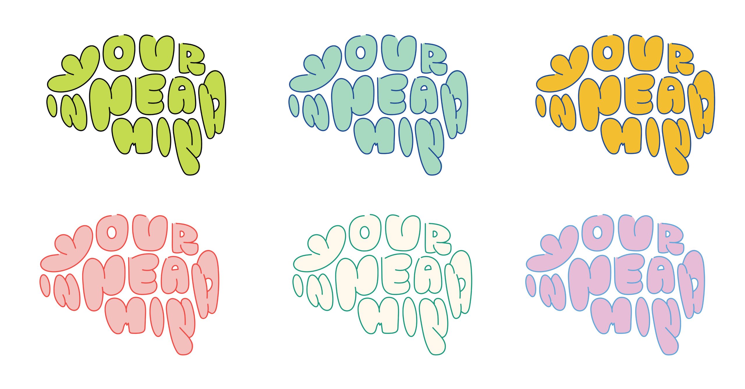
Adjust the color palette to be less contrasting, evoke a sense of calm and support for mental health.
Concept 2: Provide variations with different text and logo positions.
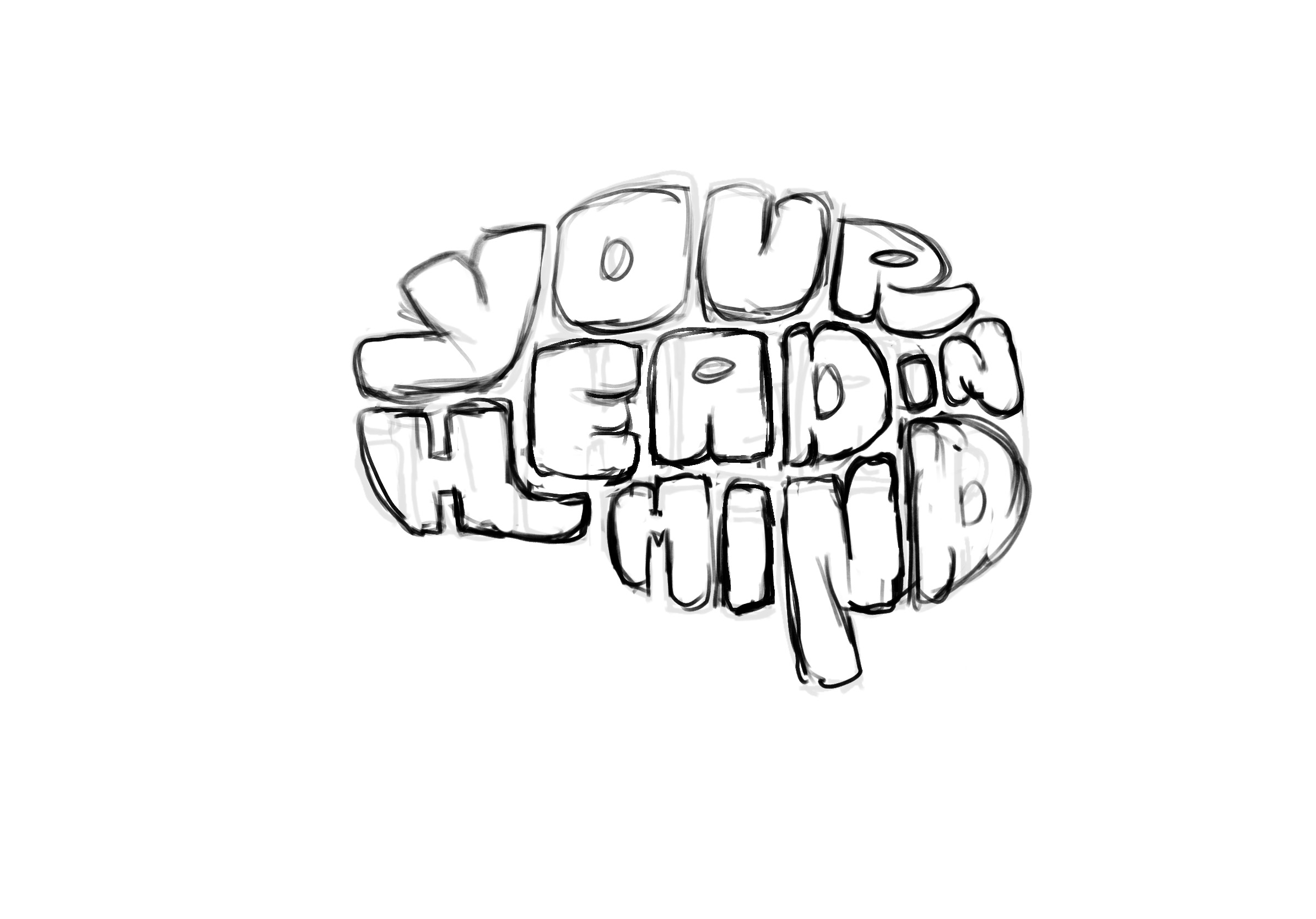
Concept 3: Refine shape to better resemble a brain.
For the font, we wanted something that stood out and reflected the brand’s creativity. Inspired by water droplets, we designed letters that vary in size and width to represent water’s characteristics. We created two versions: the original font and “Kahunam Splash,” which looks like water droplets splashing.
Second client feedback
Task: Receive and analyse the second round of feedback.
Actions:
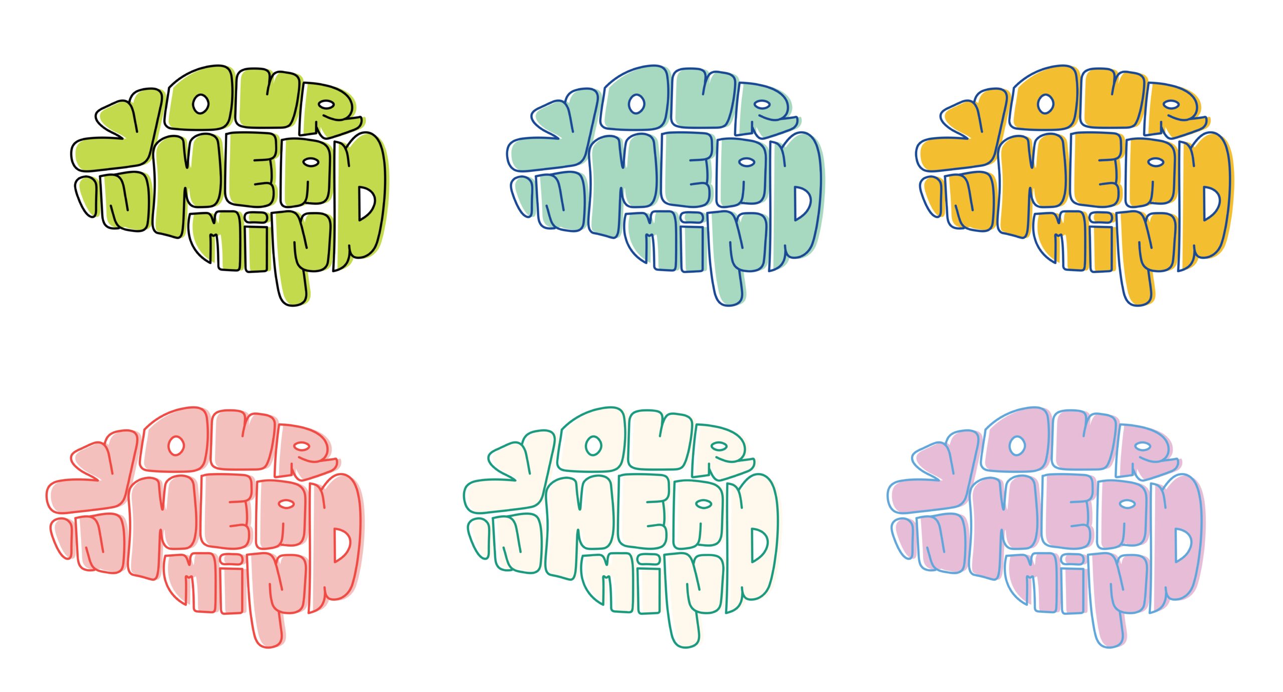
Request to adjust text order for clarity.
Client approves Concept 3A (Brain Text Concept) but expresses concerns about readability.
The text “Your In Head Mind” may be misinterpreted.
Final revisions and client approval
Task: Implement final changes based on the second round of feedback.
Actions:
Scott and the team confirm the selection of the final logo.
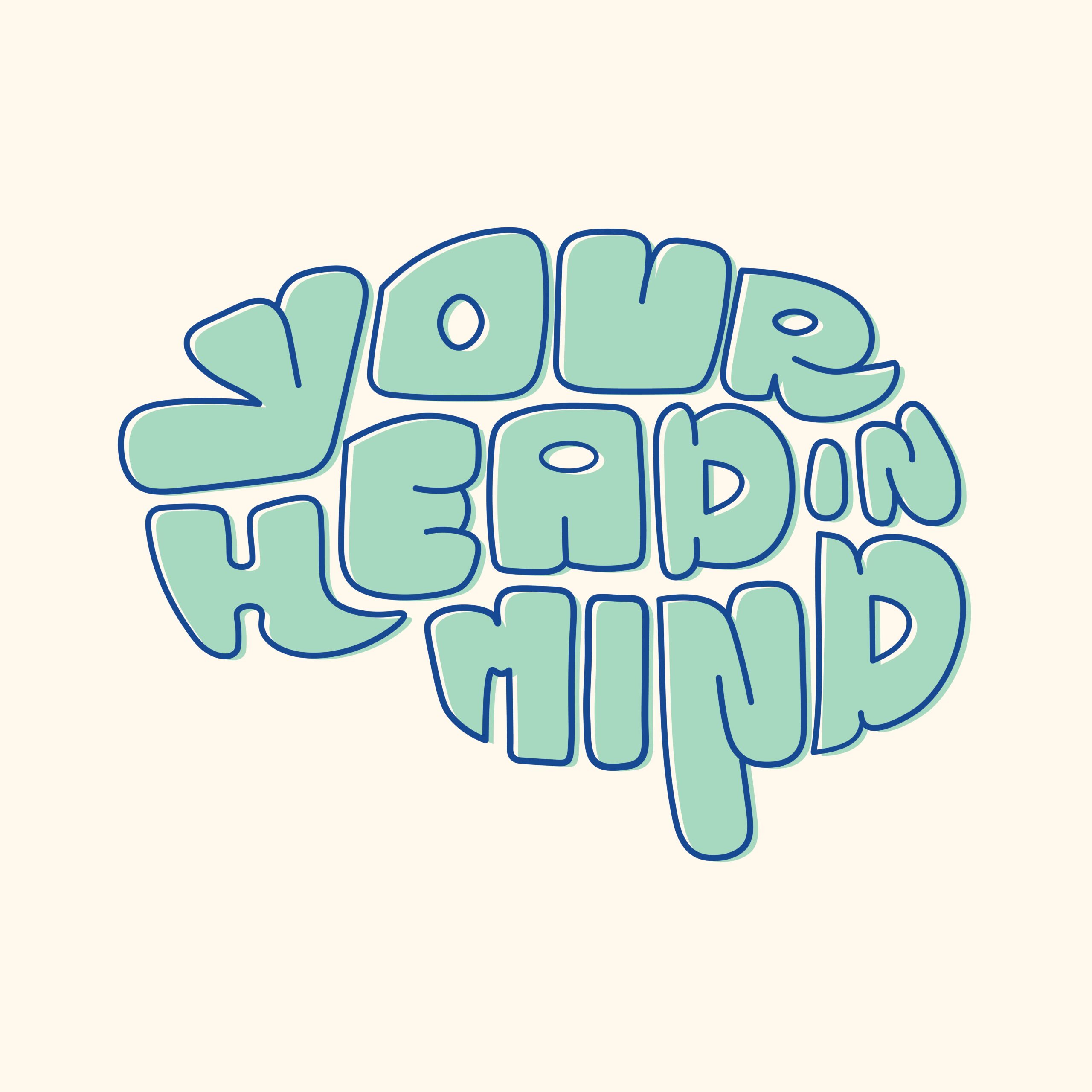
Adjust the text in Concept 3A to clarify the brand name and improve readability.
Finalise logo and visual identity after client approval.
Final delivery
Task: Deliver the final brand assets and logo.
Actions:
Submit the finalized logo and design files.
Upload files to the project Trello board.
Creation of brand guidelines
Task: Develop comprehensive brand guidelines for the client.
Actions:
Create patterns and background designs using the finalized logo.
Document color palette, typography, logo usage rules, and icon placement.
Ensure all assets align with the brand’s friendly and health-supportive message.
Upload the brand guidelines PDF to Trello for client access.
What’s next
Our handover included the logo pack, designs optimised for social media, and a detailed brand guidelines document, so that the team at YHIM can keep things looking sharp. It’s great to see the new logo now showing up on all of Your Head in Mind’s online presence, like their website and social media.
This project shows how powerful chance meetings can be. What began as a lucky find on LinkedIn has grown into a great teamwork, helping with the important job of supporting mental health.
Kahunam helped bring my brand idea to life. They were attentive to my needs and receptive to my feedback throughout the process. If you’re looking to create a logo that truly reflects your brand’s voice, I highly recommend their services.
– Kyle Clow – Founder
We are excited to see the brand’s growth
Here at Kahunam, we really enjoyed this design challenge – creating an identity for a project which is so close to the founder’s heart is challenging. As is creating an identity which tackles a sensitive topic for some. Your Head in Mind is now up and running online. We’re excited to see how the brand grows and helps people with their mental health.
