Your Shopify store should convert better.
This checklist helps.
Homepage
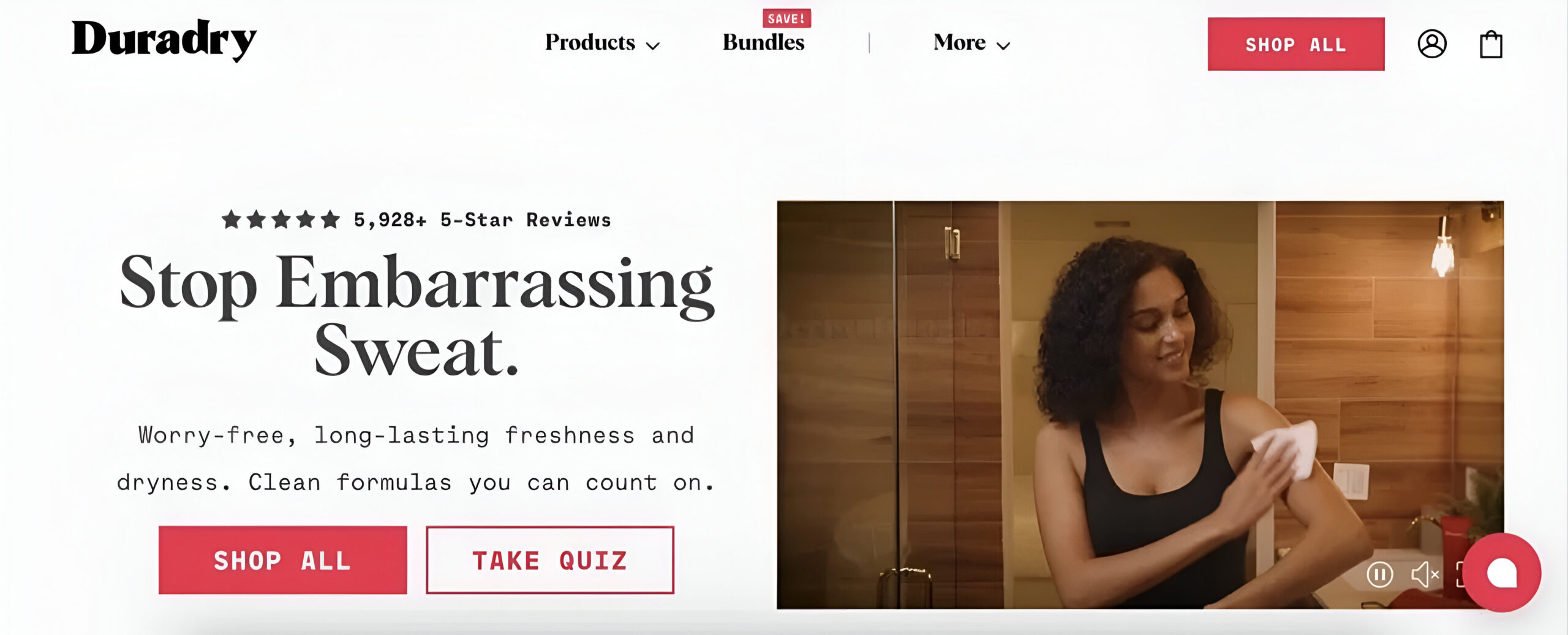
Value Proposition
Display clear value proposition above the fold to indicate value
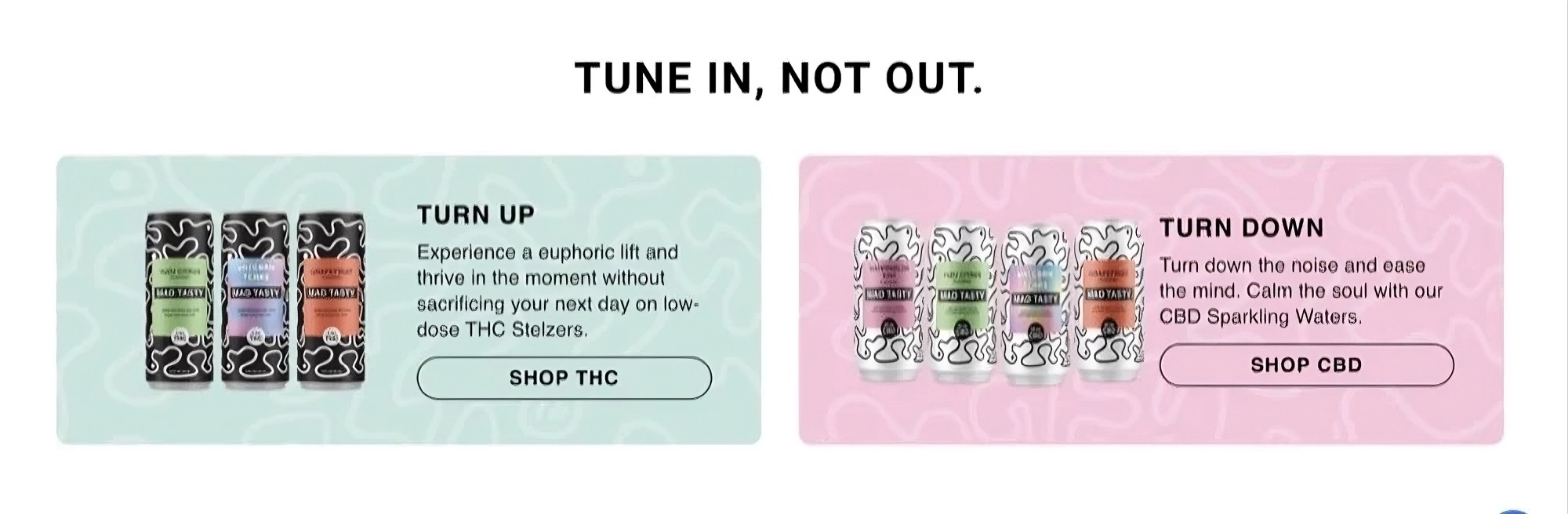
Product Catalog Display
Feature different products on homepage to show breadth of catalog

Personalized Content
Show personalized sections for different groups of customers

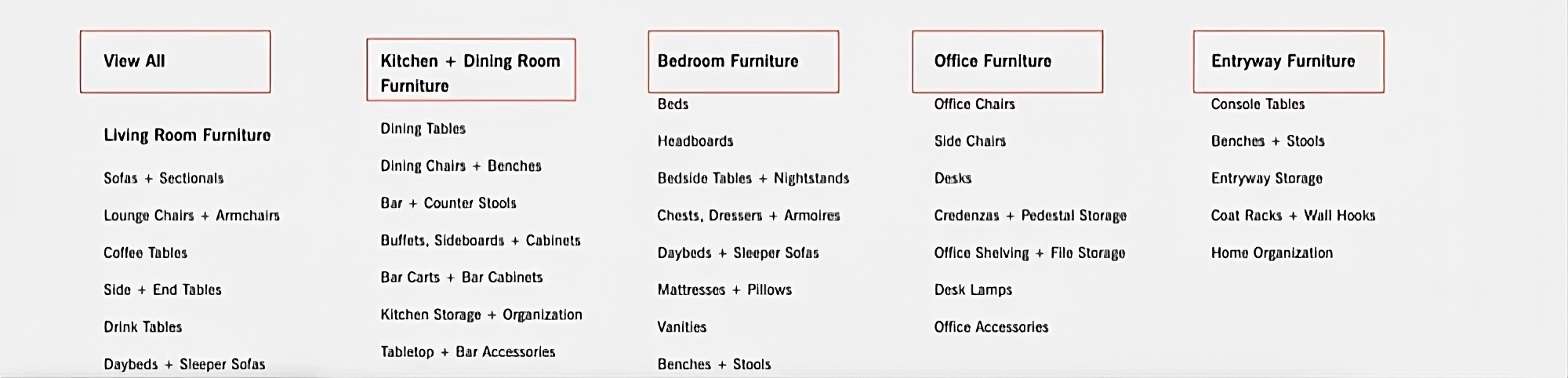
Category Hierarchy
Display categories with clear visual hierarchy for easy navigation
Primary CTA
Place prominent “Shop Now” call-to-action button above the fold
Shopping Benefits
Showcase unique selling points and shopping advantages

Product Page
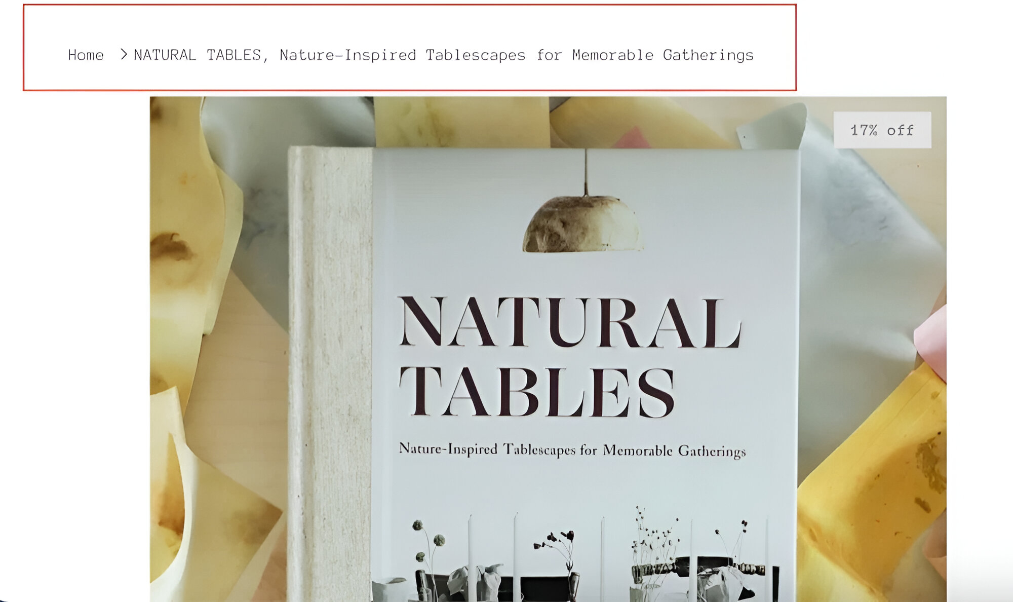
Breadcrumbs
Include breadcrumb navigation showing the path from homepage to current product
Product Images
Display multiple high-quality product images with zoom functionality
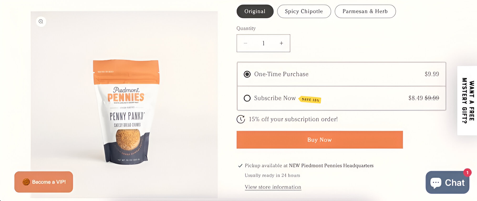
Image Gallery
Implement an effective image gallery that shows all product angles

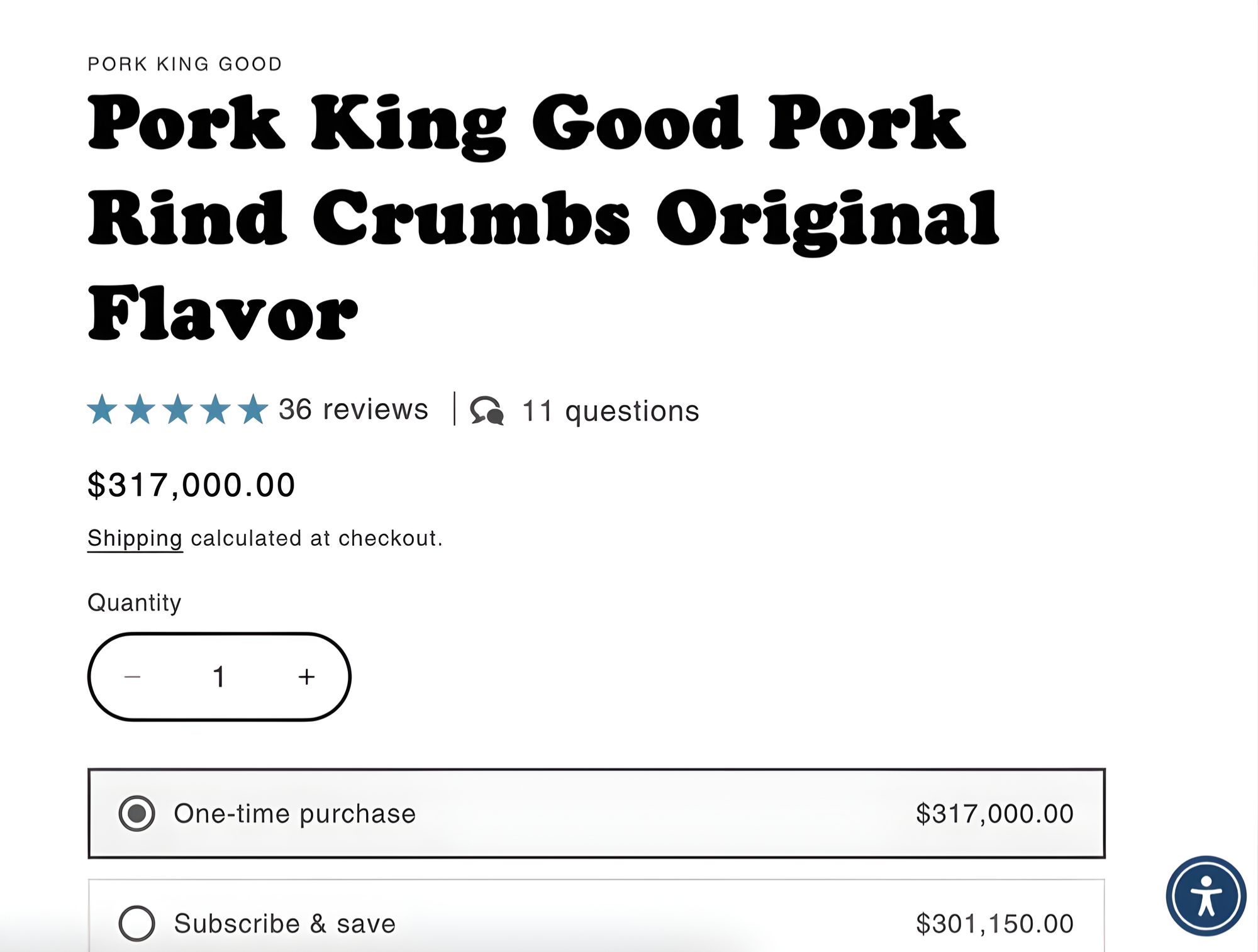
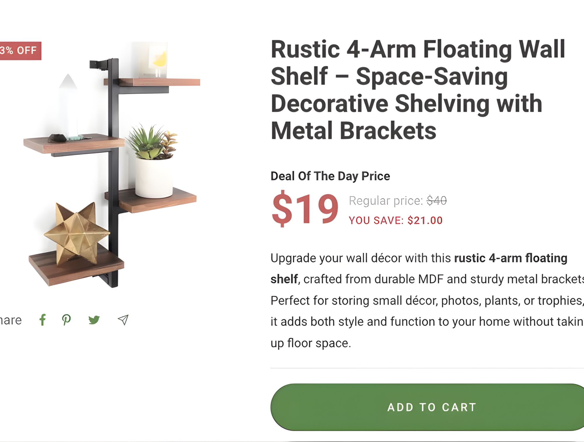
Product Title
Display clear, descriptive product title at the top of the page
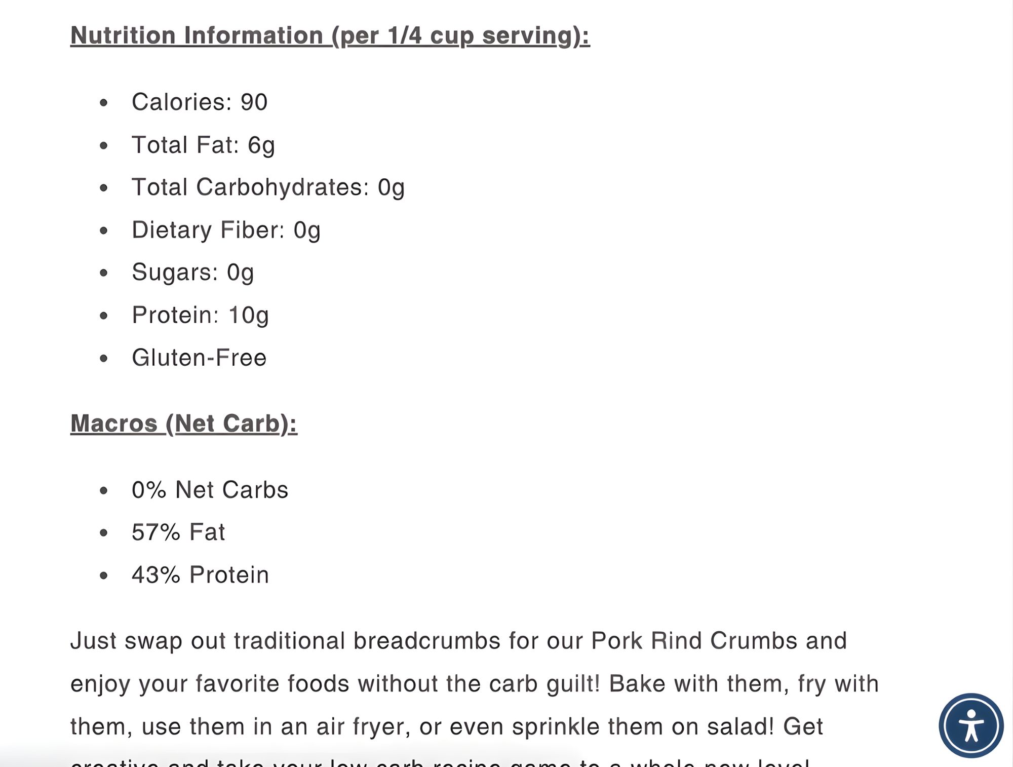
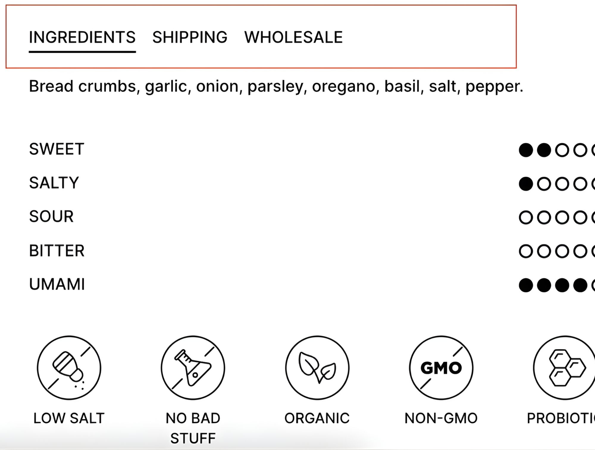
Product Description
Include detailed, well-formatted product description with key features
Price Display
Show current price clearly with sale/compare-at pricing when applicable
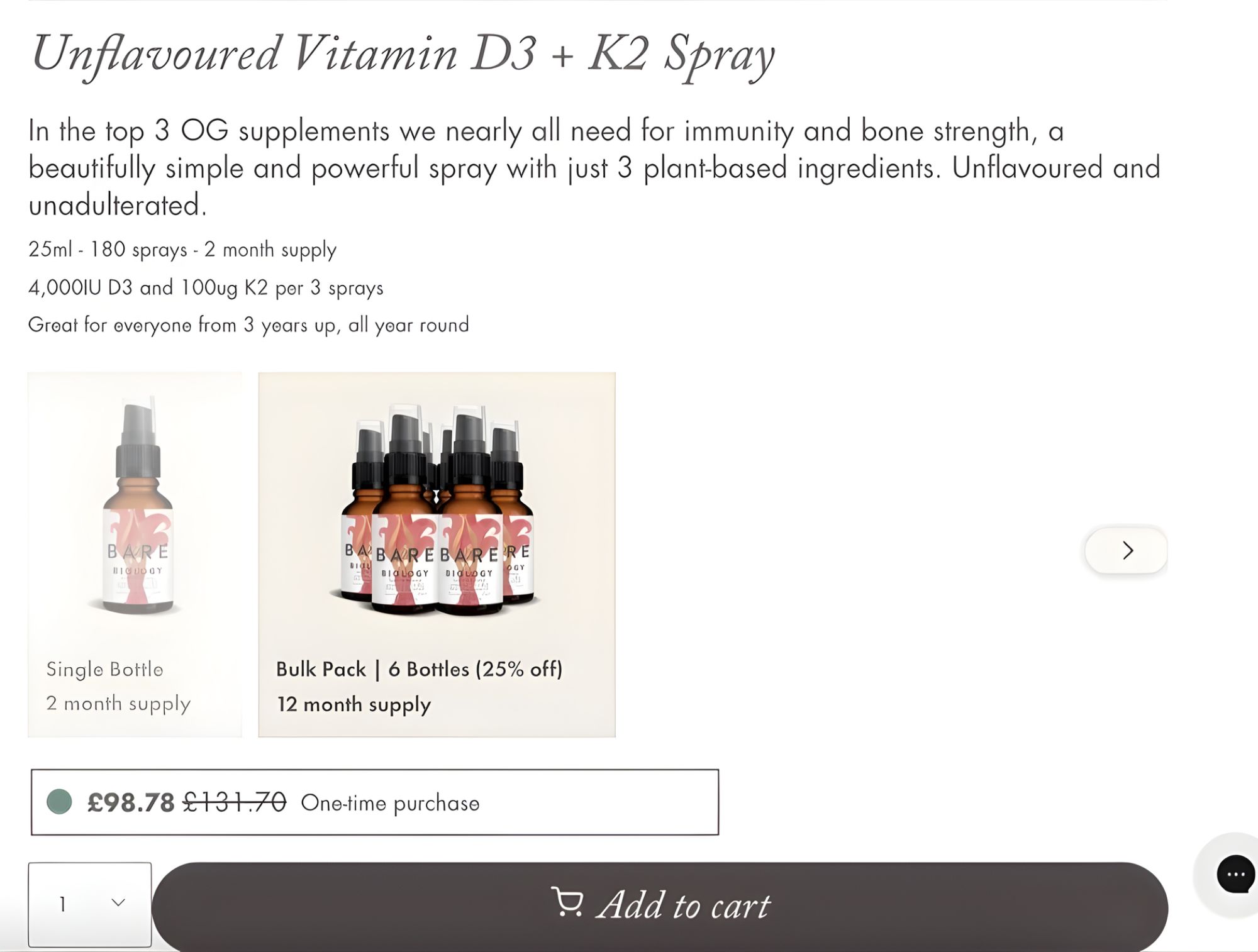
Variant Selection
Make variant options (size, color, etc.) clear and easy to select
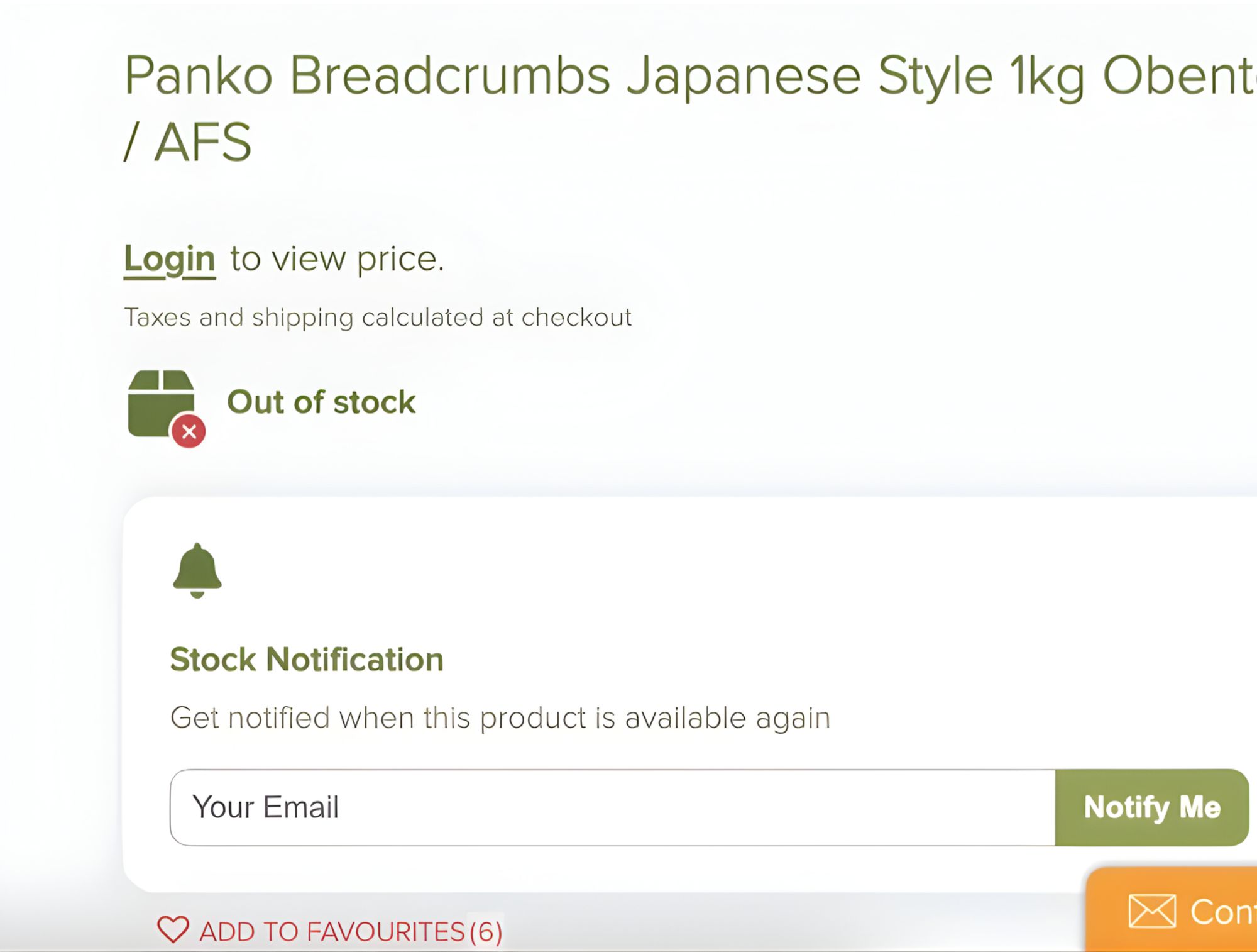
Out of Stock
Indicate when variants are out of stock and provide back-in-stock options
Add to Cart
Feature prominent “Add to Cart” button with clear visual feedback
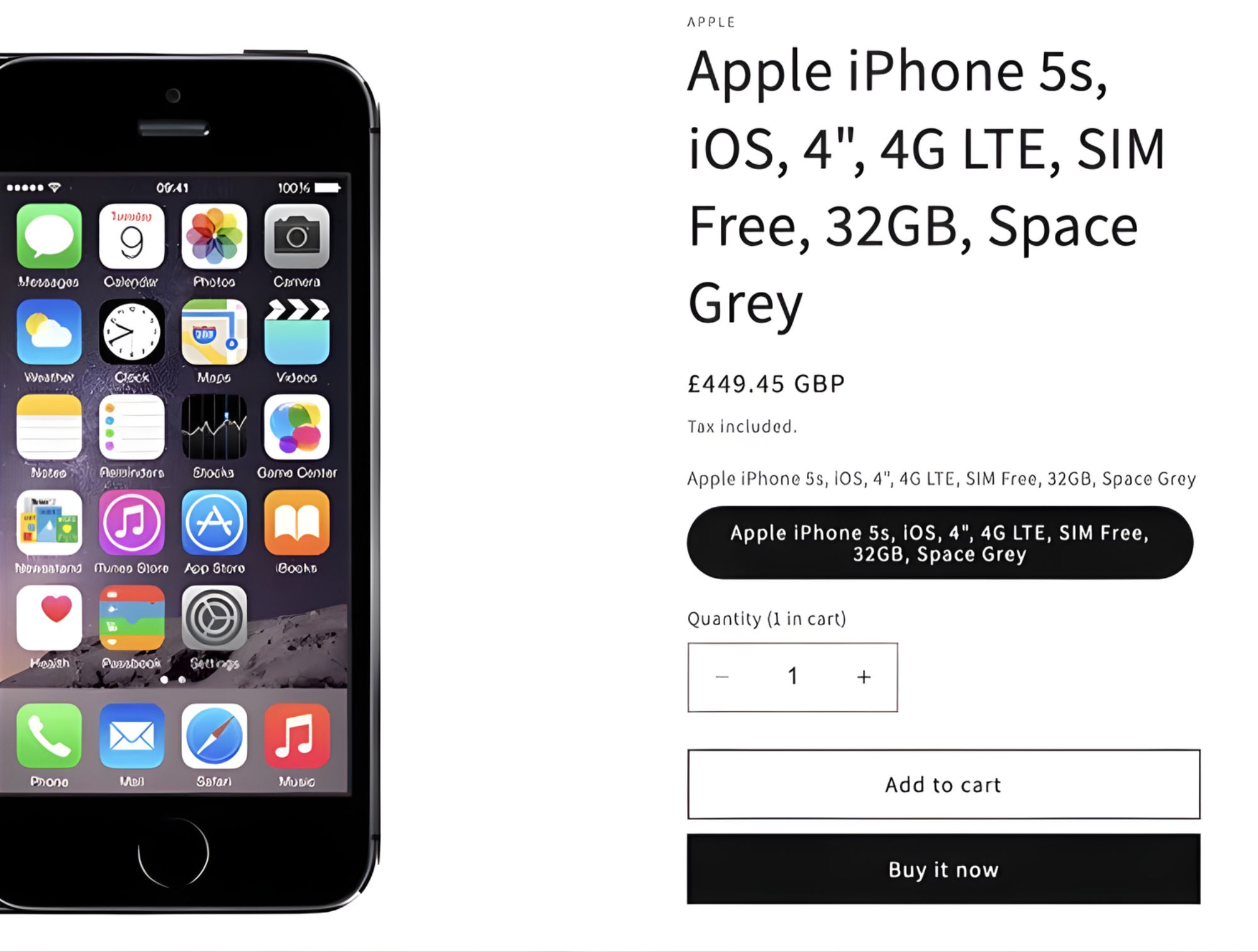
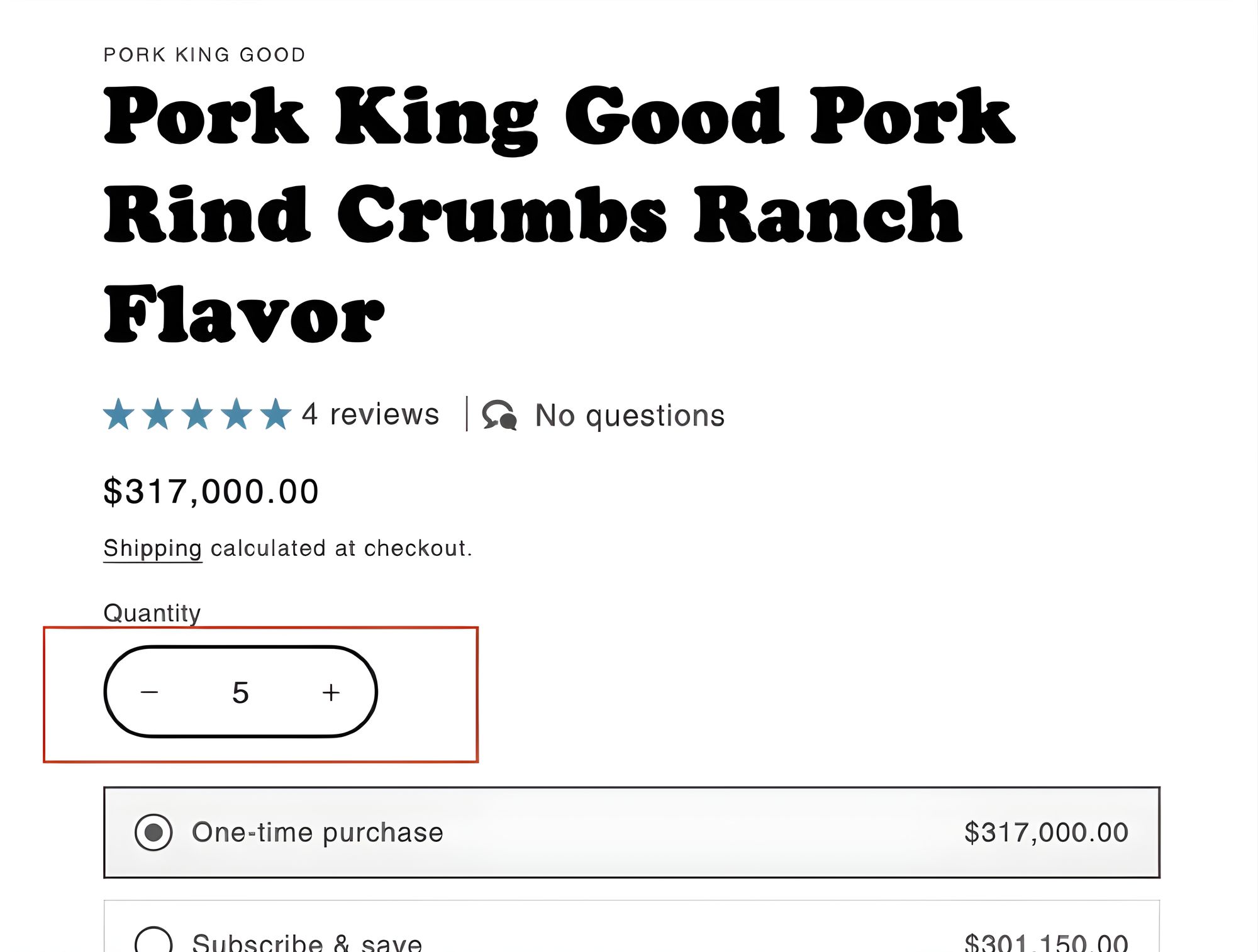
Quantity Selector
Include an intuitive quantity selector for multiple items
Product Tabs
Organize detailed information in tabs (description, specs, shipping, etc.)
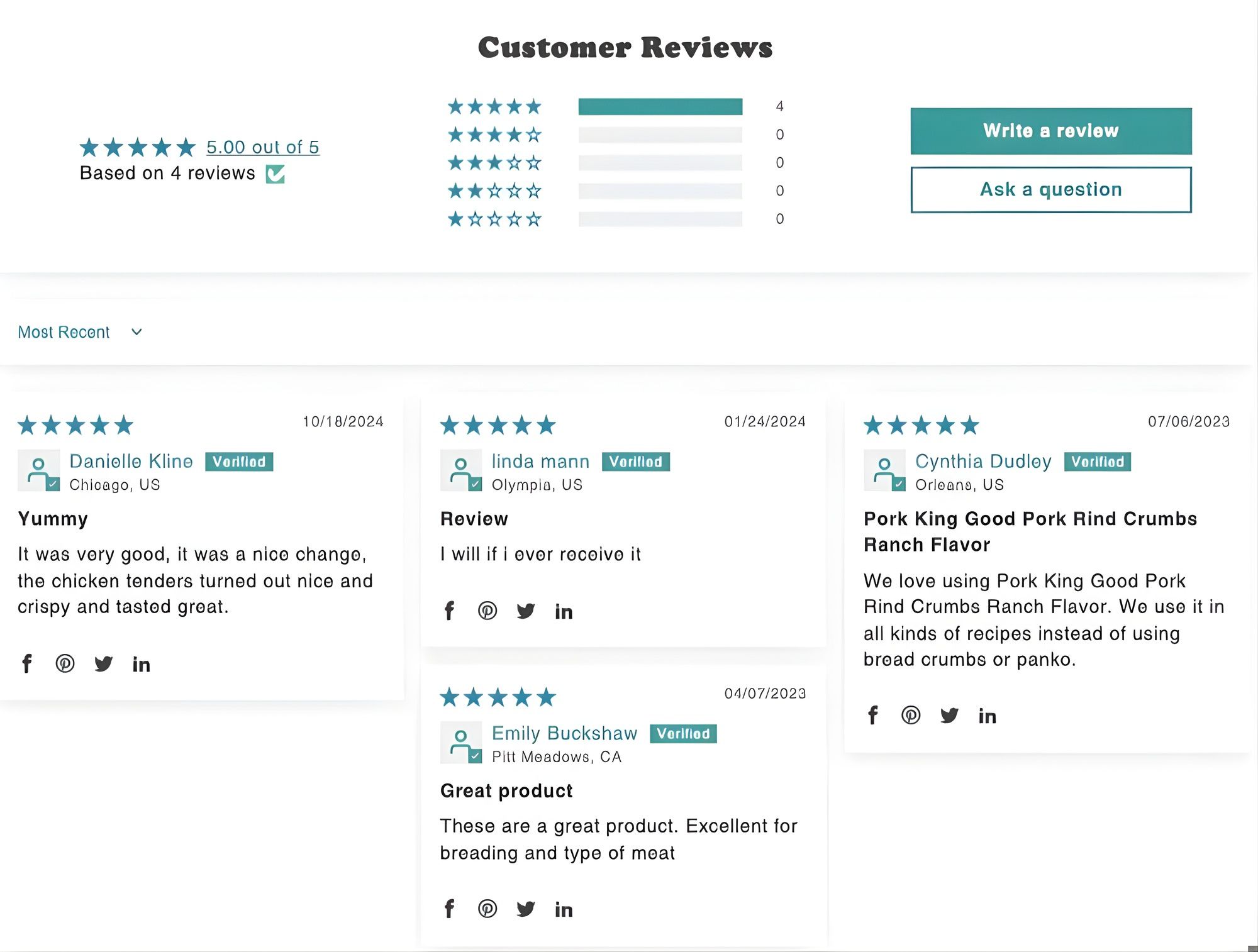
Reviews
Display customer reviews and ratings prominently
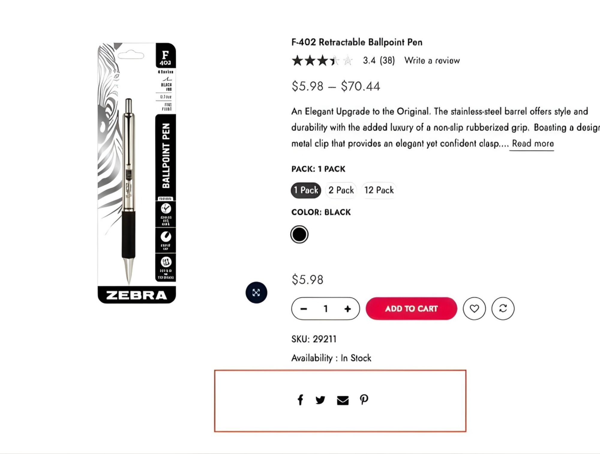
Social Sharing
Include easy social sharing options for products
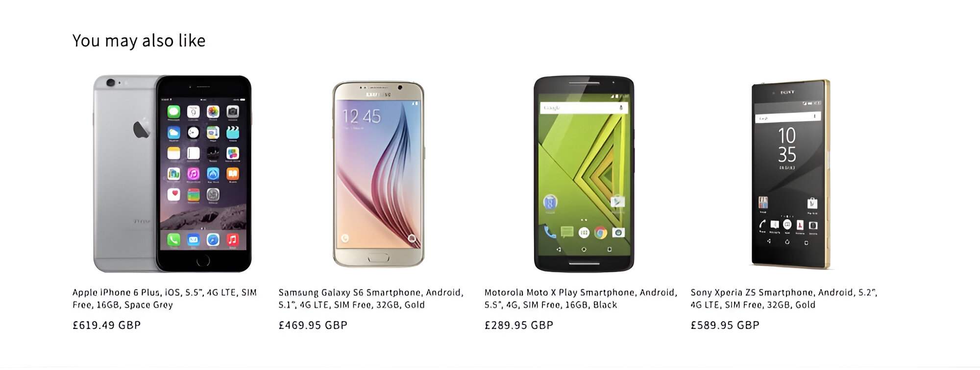
Related Products
Show relevant related or complementary products to encourage additional purchases
Recently Viewed
Display recently viewed products for returning visitors

Collection Page
Collection Title
Display clear collection title and description at the top of the page
Breadcrumbs
Include breadcrumb navigation showing the path from homepage to current collection

Product Grid
Display products in a consistent grid layout with adequate spacing
Product Images
Show high-quality product images in consistent dimensions
Hover States
Implement interactive hover states for product grid items
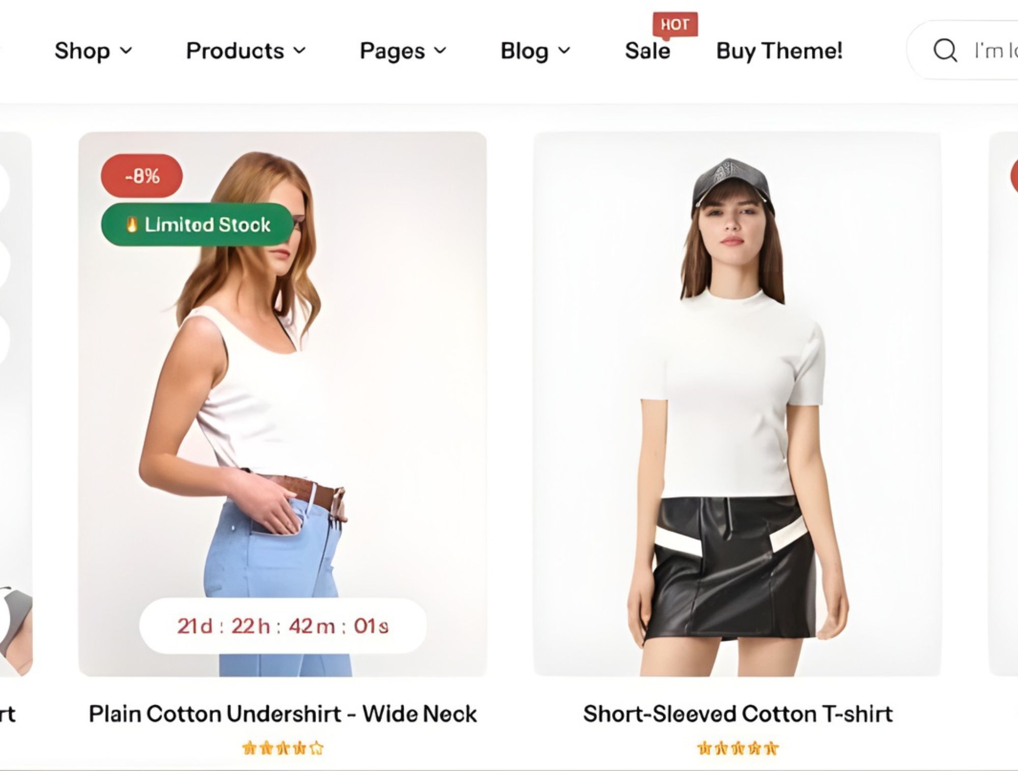
Product Titles
Display clear product titles that align with images

Price Display
Show product prices clearly with sale/compare-at prices when applicable

Product Variants
Show available color/size options in collection view if possible

Filtering
Provide relevant filtering options for collection (price, size, color, etc.)

Sorting
Allow users to sort products by relevance, price, newest, etc.

Pagination
Implement proper pagination for collections with many products

Empty Collection
Show helpful alternatives when a collection has no products
Navigation
Parent Categories
Make parent categories clickable to allow customers to see general category page before specific subcategories
Visual Hierarchy
Differentiate categories and subcategories with font styling, indention, and spatial indicators
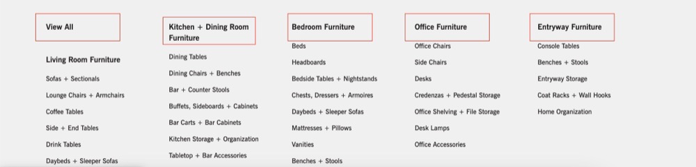
Category Naming
Use descriptive category names, avoid site-specific labels that require guessing

Special Categories
Show “New” and “Sale” as separate categories for easy access to new items and deals

Contact Information
Make contact information easily accessible in header

Store Locator
Include store locator in header if offline sales are important

Logo Navigation
Ensure logo always links to homepage
Search
Search Box
Display a prominent and wide search box directly in the header (top-right or center), not just a small icon. Ensure it’s wide enough to fit typical search terms (25+ characters)

Autocomplete & Preview
Implement autocomplete that shows matching products and categories as users type. Include product images in the preview results to improve recognition, and ensure category links are included alongside individual product suggestions

Smart Search Logic
Implement search functionality that handles common typos, misspellings, and alternative terms (e.g. “denim” vs. “jeans”) to return relevant results even when users don’t type exact matches

Search Result Controls
On the search results page, provide sorting options (e.g. relevance, price, newest) and allow users to filter results by category, size, price, or other attributes to refine their search.

No Results Page
Show helpful alternatives when no results are found


Did you find this checklist helpful for your website?
If so, we’ll tell you a secret: we have more checklists, but they are only for subscribers. We also send out useful tips/tricks for your website monthly, as we want to be an invisible hand that helps you. So join the newsletter to get them.