
The design of text labels in web forms isn’t just about making them look nice; it’s about making them easy to use and accessible to everyone. As website owners or marketers, it’s important to know how to use different styles so designers and developers can make web forms clearer, easier to use, and more accessible, giving users a better experience. Bad text labels can frustrate visitors and make them skip the form, which might mean losing sales opportunities.
In this article, we’ll look at different ways to design text labels in web forms, including their pros and cons and best practices for using them.
What is a text label on a website?
A text label on a website is a piece of text that tells you what to do or what to enter in a form field. For example, in a sign-up form, the label “Name” next to a blank box tells you to type your name in that box. Text labels make it easier for people to understand what information is needed.
The usage of text label
It helps users know not just what type of element they’re dealing with, but also what it means and how they can interact with it. This makes the whole browsing experience more understandable and easier for everyone.
6 design options for text labels
Getting text labels right on your website makes forms easier for people to fill out, which means more completed forms and happier users. As a site owner or marketer, knowing the different ways to design text labels can help you create the CRO and reach sales goals. Here are some design options for text bales
Top-aligned Labels
Top-aligned labels are when the labels for form fields are placed directly above the input boxes. They are indeed a highly recommended choice for form design, particularly for their ability to improve the speed and ease with which users can complete forms.
The benefits of top-aligned labels include easier and quicker form completion since users can move their eyes straight down the form without needing to shift horizontally. This design reduces the mental effort required, making the form feel simpler and more straightforward to fill out. It also provides extra horizontal space for longer labels, which is useful for forms that might be translated into languages with longer words.
However, top-aligned labels also have some drawbacks. They make the form longer vertically, which means users might have to scroll more, potentially slowing down the process. The necessary spacing between labels and fields can interrupt the user’s flow and make the form feel even longer. Users also have to move their eyes up and down to check their inputs, which can slow them down, especially in longer forms.
Tips for using top-aligned labels:
- Keep the space between fields minimal while maintaining clarity.
- Divide lengthy forms into multiple pages or sections to avoid overwhelming users with excessive scrolling.
- Use color, shading, or borders to group related fields, aiding navigation without adding extra space.
Left-aligned Labels
Left-aligned labels are when the labels for form fields are placed to the left of the input boxes. This design has its own pros and cons that can affect how easy the form is to use, depending on the situation.
The main benefit of left-aligned labels is that they make it easy for users to scan down the labels in a straight vertical line. This is helpful when the form asks for unusual information that needs to be clearly understood. Also, left-aligned labels save vertical space because each label and input box fit into a single, narrow row. However, this means the form needs more horizontal space, which might not always be suitable for your website’s design.
The main downside of left-aligned labels is that studies show they result in the slowest form completion times. This is because the labels are further away from the input boxes, especially if the labels are short, making it harder for users to connect them quickly. This increased distance makes users spend more time and effort, slowing them down. Additionally, left-aligned labels take up more horizontal space, which is not ideal for small screens, like on mobile devices.
When using left-aligned labels, think about the context and the type of information you need. For forms that require careful attention and accurate entries, left-aligned labels help by making users slow down and focus. However, for forms where speed is important, especially on mobile devices with limited horizontal space, left-aligned labels might not be the best choice.

Right-aligned Labels
Right-aligned labels are when the labels for form fields are placed to the right of the input boxes.
The main benefit of right-aligned labels is that they create a strong visual connection between the label and the input field. This makes it easier for users to quickly see which label goes with which input box, leading to faster form completion, especially in shorter forms. Research shows that right-aligned labels can be filled out up to twice as fast as left-aligned labels because of this clear visual link.
This design works well for forms that ask for familiar information, like login forms or basic contact details. Right-aligned labels also save vertical space, just like left-aligned labels, which is good for keeping the form compact.
One major drawback is that right-aligned labels can make the form harder to read and scan because there’s no clear left edge. This issue gets worse with longer labels or when the form asks for unfamiliar information. Users might find it tough to keep their place as they go through the form, which can slow them down, especially in longer or more complex forms. Right-aligned labels also take up more horizontal space, which can be a problem for forms in multiple languages where label lengths can vary.
Right-aligned labels work best for short forms with familiar information, where the strong visual connection helps users fill out the form quickly. For longer forms or those with detailed questions, the lack of a clear left edge can slow users down and make the form harder to follow. It’s also important to consider the horizontal space available and be aware that the space on the left side of the form might look uneven.
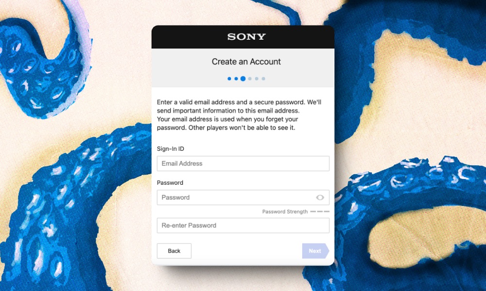
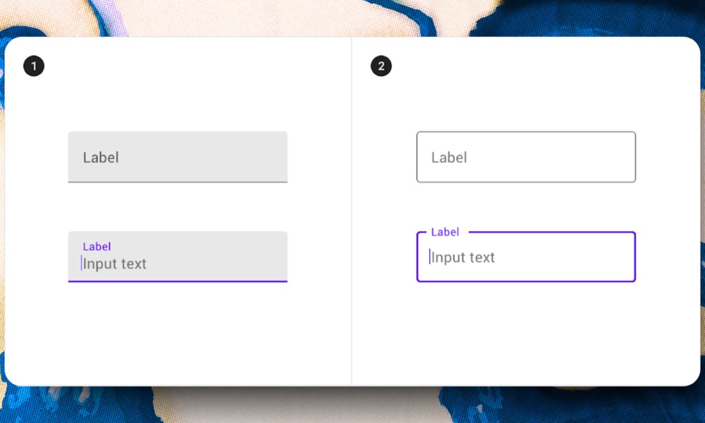
Floating Labels
Floating labels are a design feature used in forms where the label for an input field starts inside the field as placeholder text. When you click on the field or start typing, the label moves up and stays above the input area. This keeps the context of what information the field needs without needing extra space for a separate label.
Floating labels have several benefits. They save space by placing the label inside the input field until needed, making the design look clean and efficient. This is especially useful for forms with many fields or when space is limited. They also look modern and attractive, adding a bit of animation and interactivity to the form, which makes it feel more engaging. They also highlight the active field by moving the label up, making it obvious where you are typing.
However, floating labels have some downsides. Many users aren’t familiar with them, which can cause some discomfort and lead them to abandon the form. They also require a bit more mental effort because of the animation and changing states of the input fields, which can be tiring if there are many fields to fill out. Additionally, the placeholder text in floating labels is often low in contrast, making it hard to read, especially for those with vision difficulties. This can lead to confusion, with users mistaking placeholder text for auto filled data, resulting in error messages.
Label as Placeholder
Placeholder texts are hints or brief descriptions inside an input field that tell you what to enter. Labels, on the other hand, are identifiers that sit outside the input field and tell you what the field is for. Labels are important because they explain what information is needed.
While placeholder texts can be useful, they can also create a bad user experience if used incorrectly.
It’s important to make sure users can tell the difference between placeholder text and the actual text they enter. If placeholder text is too dark, users might think it’s something they’ve already typed, which can be confusing.
If the placeholder text is too light, it can be hard to read, especially for people with vision problems. Also, not all screens display colors the same way.
Using placeholder text instead of labels can be tricky. When you start typing, the placeholder text disappears, which can make it hard to remember what you were supposed to type. Sometimes, users have to delete what they’ve typed just to see the placeholder text again for reference.
Without labels, it’s hard to quickly review a completed form and check if the information is correct.
Help texts give extra information about what to enter in a field. If you use placeholder text as help text, it can be hard to remember the instructions once you start typing, especially if the instructions are long.
In some cases, using placeholder text as help text works for simple fields, like an email address. But for more complex fields, like creating a password with specific characters, it can be confusing.
Tooltip text label
Tooltip text labels in web forms are small pop-ups that appear when users hover over or click on a form field. These tooltips provide extra information or instructions for filling out the form, helping users understand what information is needed.
Tooltips offer several advantages. They help keep the form tidy by giving useful tips without cluttering the design. This makes the form look clean and simple while still providing helpful guidance. Tooltips can reduce mistakes by clarifying what information is needed, leading to more accurate form submissions. They can also provide examples or formatting tips, which further assists users in filling out the form correctly.
However, there are disadvantages to using tooltips. They depend on user actions, like hovering or clicking, so some users might miss the information if they don’t do these actions. Tooltips can be tricky for mobile users because hovering isn’t an option on touchscreens. Using too many tooltips can make the form appear cluttered and overwhelm users with too much information. Additionally, if tooltips are not well-designed or placed correctly, they can block the form fields and cause frustration.
Tips for Using Tooltips:
- Make sure tooltips are easy to read and accessible for everyone, including those using assistive technology.
- Use simple, clear language so the information is easy to understand.
- Don’t rely only on tooltips for important instructions; use them to add to the main labels and help texts.
- Test tooltips on different devices and browsers to make sure they work well.
- Use tooltips only for essential information to keep the form clean and user-friendly.

Making Text Labels Easy for Everyone
When we design forms on websites, we need to make sure everyone can use them, including people with disabilities. This is called “web accessibility“
Why accessibility is important
In many countries, the law is written that websites have to be accessible to everyone. When creating forms, if they are easy for everyone to use, more people can become customers.
Problems with some popular designs
Some trendy designs can make forms hard to use:
- When there are no visible labels, people using screen readers can’t understand the form.
- When the label disappears as you start typing, it’s hard for people who might forget what the box was for.
- Labels that move when you click can be confusing for some people and might not work well with screen readers.
Good ways to make labels work for everyone
- Keep labels visible all the time, not just as hints that disappear.
- Use special HTML code that connects the label to the right box.
- Make sure your labels clearly say what information is needed.
- Don’t move labels around in different parts of your form.
- Use colours that stand out from the background.
- If someone makes a mistake, explain clearly how to fix it.
FAQs about Text Labels Design in Web Forms
What is the best position for text labels in web forms?
The best position for text labels depends on the form’s context and design. Common positions include top-aligned, left-aligned, and inline with the field. Top-aligned labels are generally easier to read and scan, especially on mobile devices.
What are some best practices for labeling optional and required fields?
Clearly indicate required fields with an asterisk (*) or the word “required” next to the label. For optional fields, consider adding the word “optional” to avoid any confusion. Consistent visual indicators help users understand the form requirements easily.
Author